tingchun.a.lai@gmail.com
tingchun.a.lai@gmail.com

Menu

Schedule Builder
Schedule Builder
Reimagining how attendees plan an 800+ session event.
Overview
As the lead product designer, I optimized the planning journey to improve discovery, decision-making, and schedule management. I led UX UI design strategy and collaborated closely with PO, engineering, and event teams to boosted pre-event planning by 43%, saved 10K+ sessions with Watch Later, and achieved a 95% satisfaction rate.
As the lead product designer, I optimized the planning journey to improve discovery, decision-making, and schedule management. I led UX UI design strategy and collaborated closely with PO, engineering, and event teams to boosted pre-event planning by 43%, saved 10K+ sessions with Watch Later, and achieved a 95% satisfaction rate.
Time
Jan 2022 - Mar 2022
Role
Lead Product Designer
Deliverables
Product Strategy
Research
Prototyping
Testing
Iteration
Teams
1 Principal PM manager
2 Event program managers
1 Producer
1 3D graphic designer
Dev team
Time
Jan 2022 - Mar 2022
Jan-Mar 2022
Role
Lead Product Designer
Teams
Principal PM manager
Event program managers
Producer
3D graphic designer
Dev team
Deliverables
Product Strategy
Research
UX/ UI Design
Testing
Iteration
Problem Statement
Users had difficulty discovering, deciding, and managing sessions, resulting in incomplete schedules and lower event engagement.
Users had difficulty discovering, deciding, and managing sessions, resulting in incomplete schedules and lower event engagement.
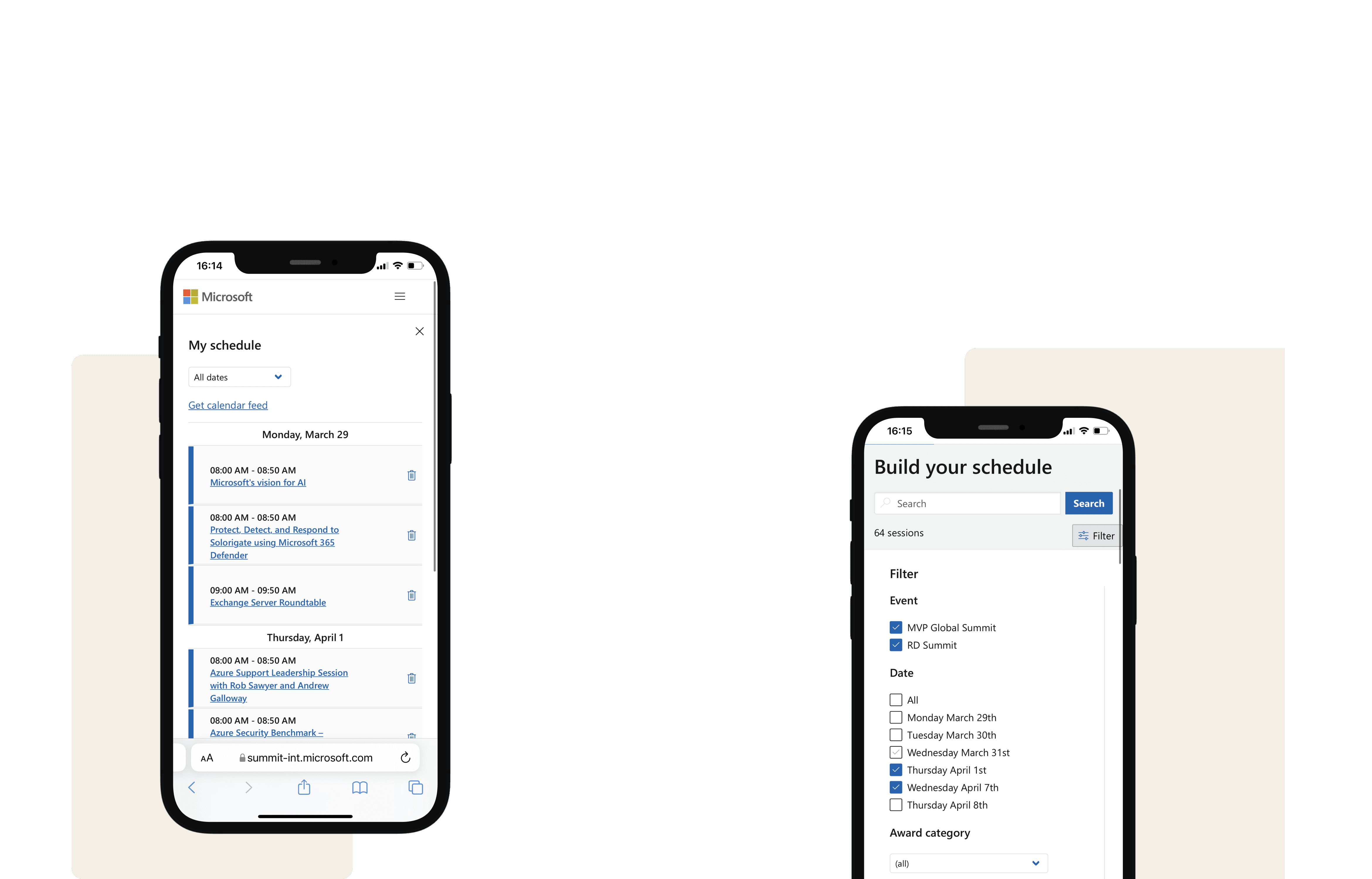
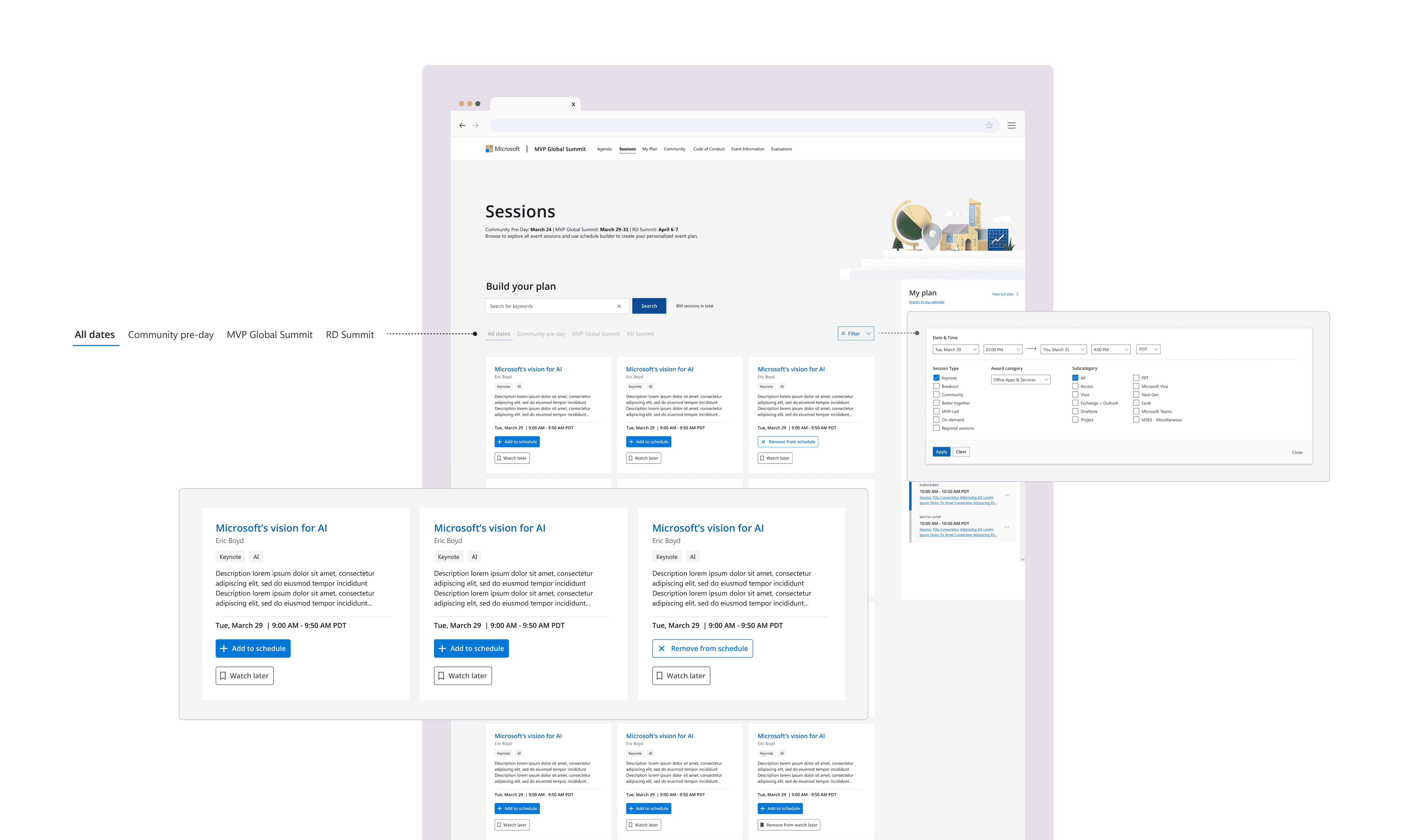
Tab Filter
Simplified browsing with top-level event filters, improving session discovery speed.
New Feature
Tab Filter
Simplified browsing with top-level event filters, improving session discovery speed.
New Updates
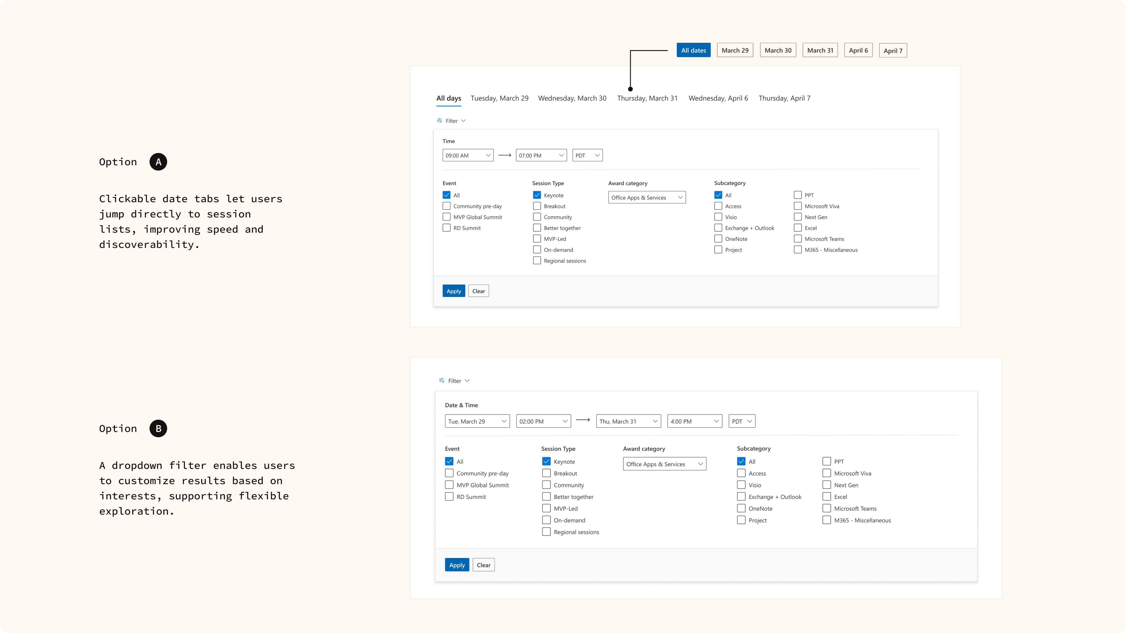
Dropdown Filter
Added date, time, timezone, and category filters for precise, context-based search.
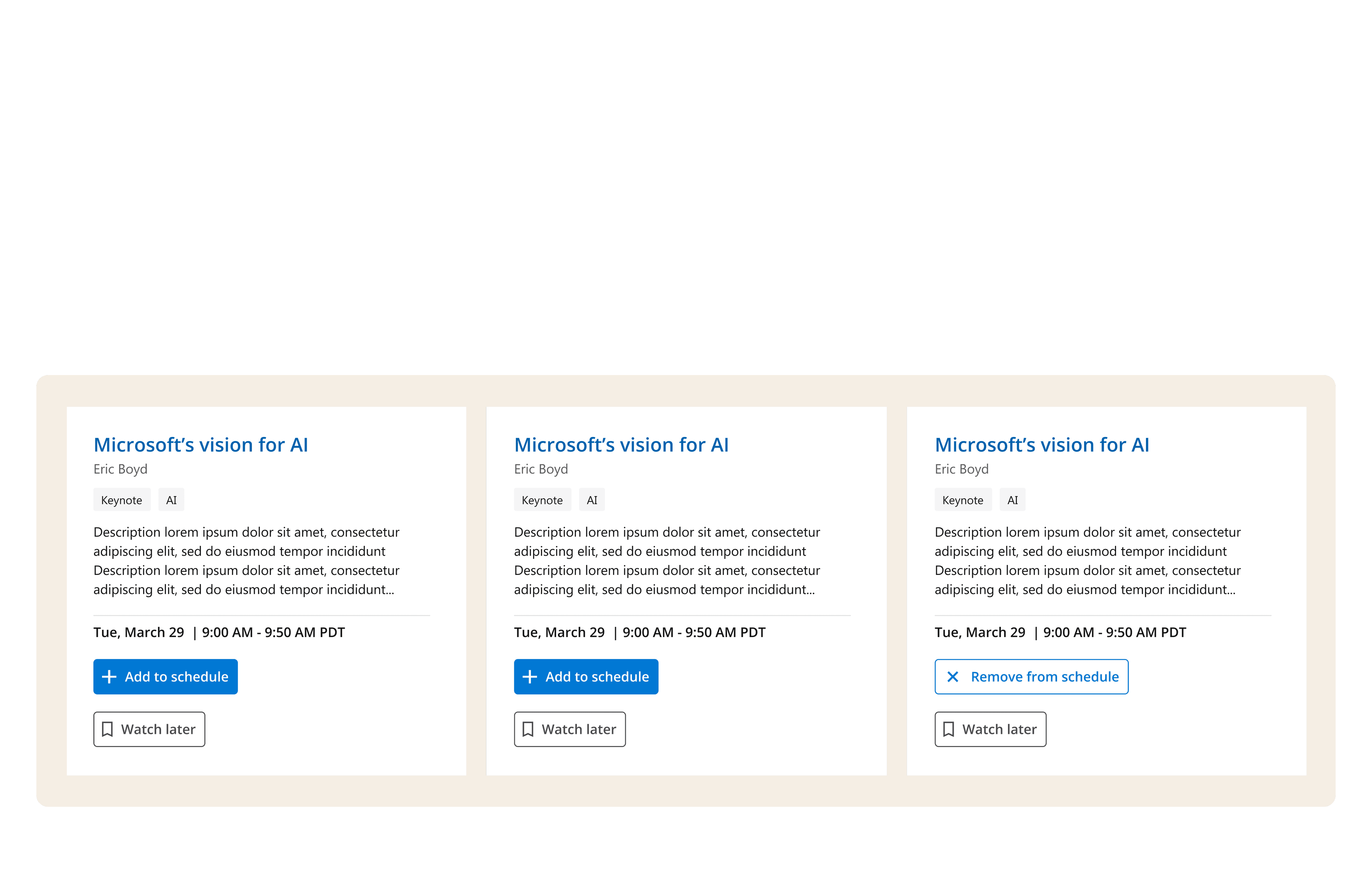
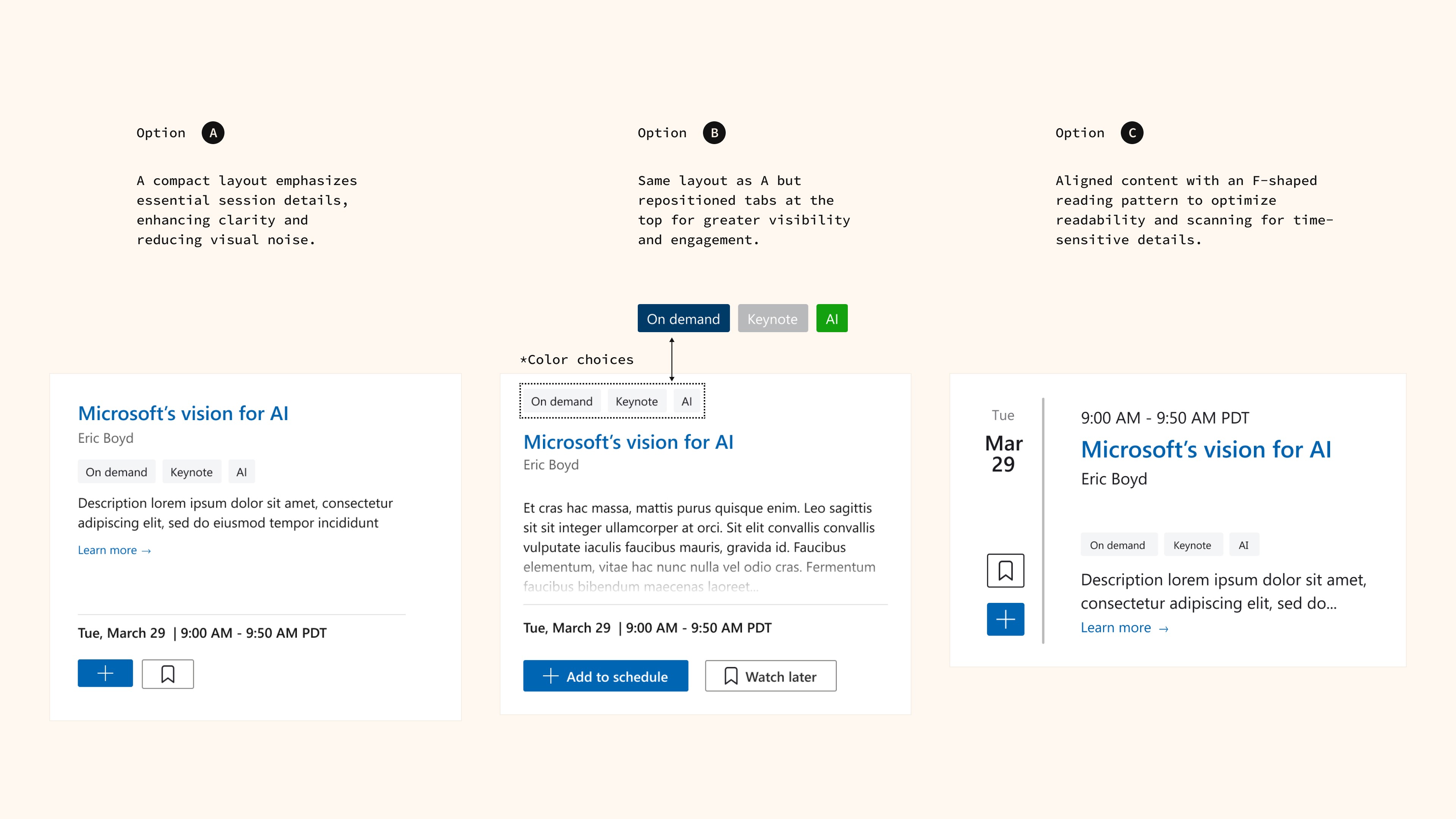
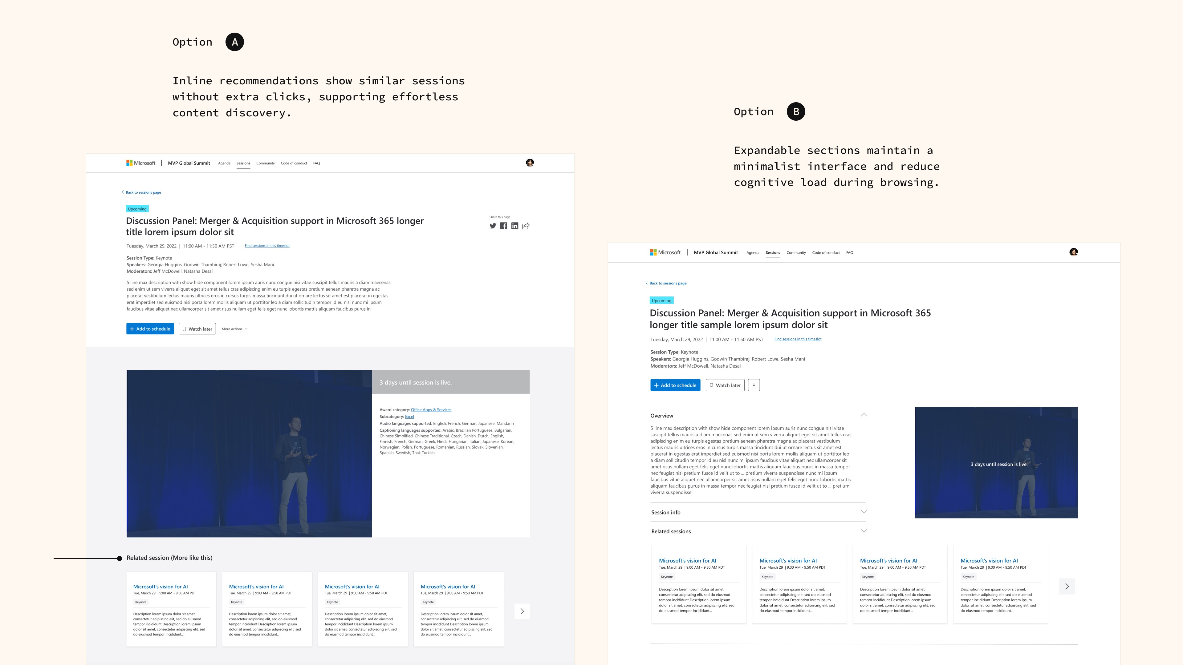
Scannable Content Card
Enhanced scannability by surfacing key info upfront for quicker decision-making.
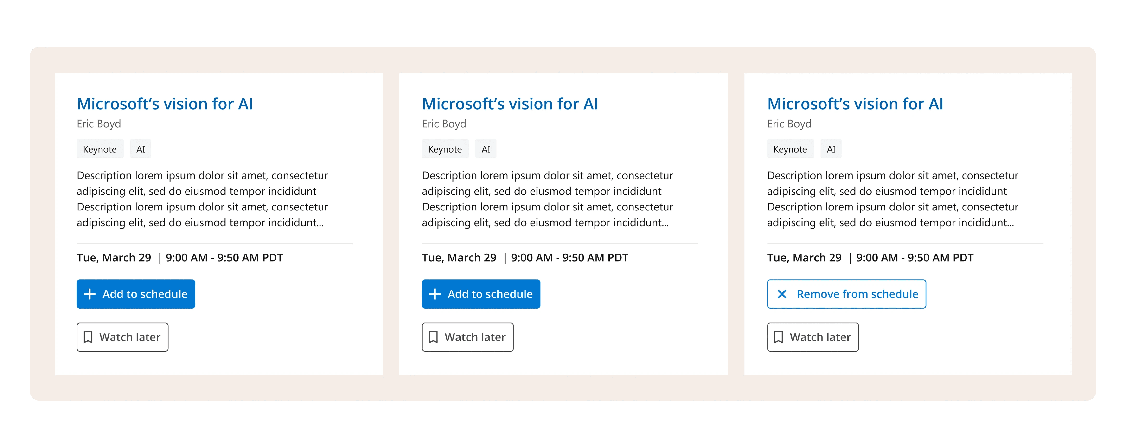
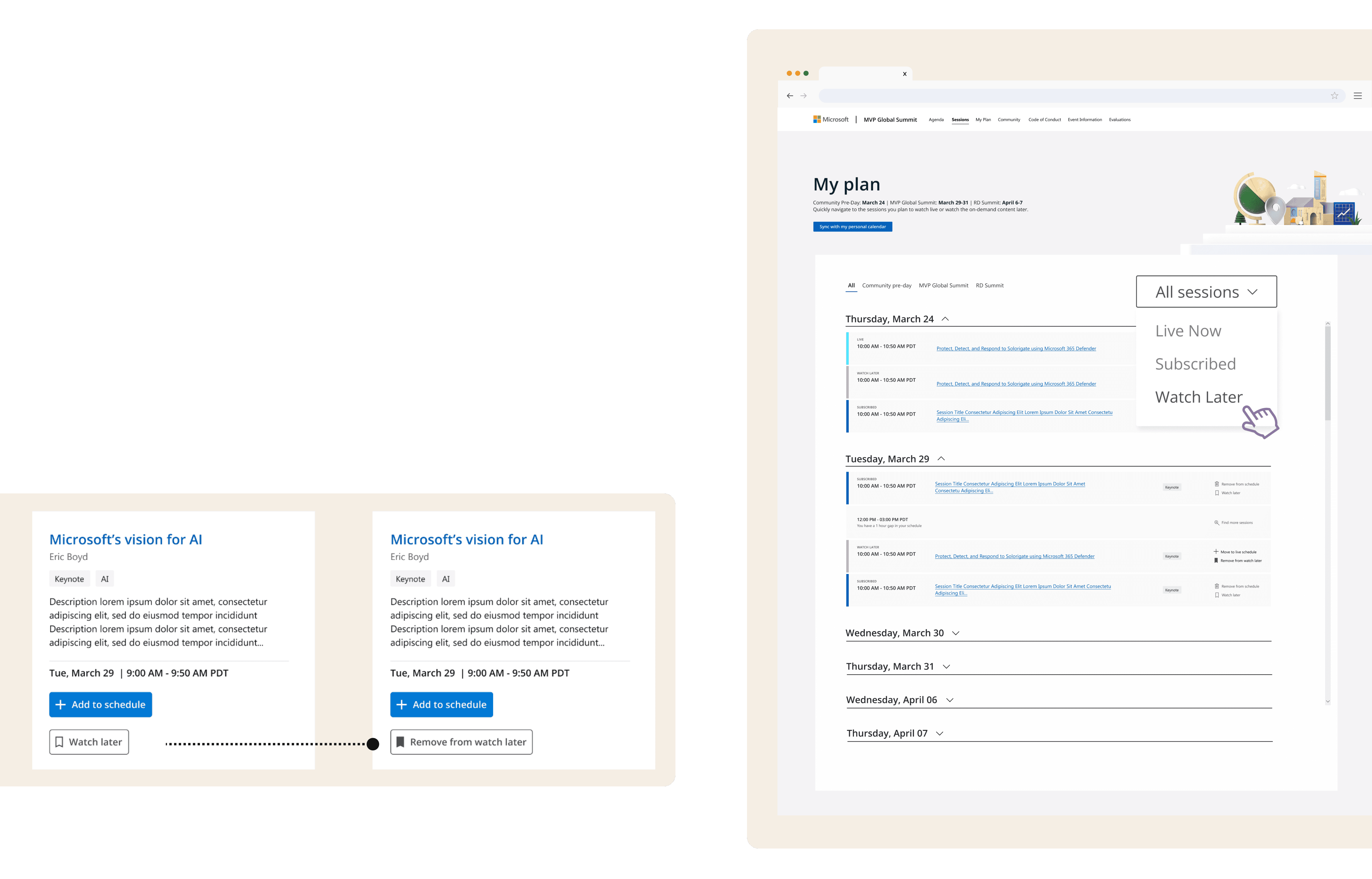
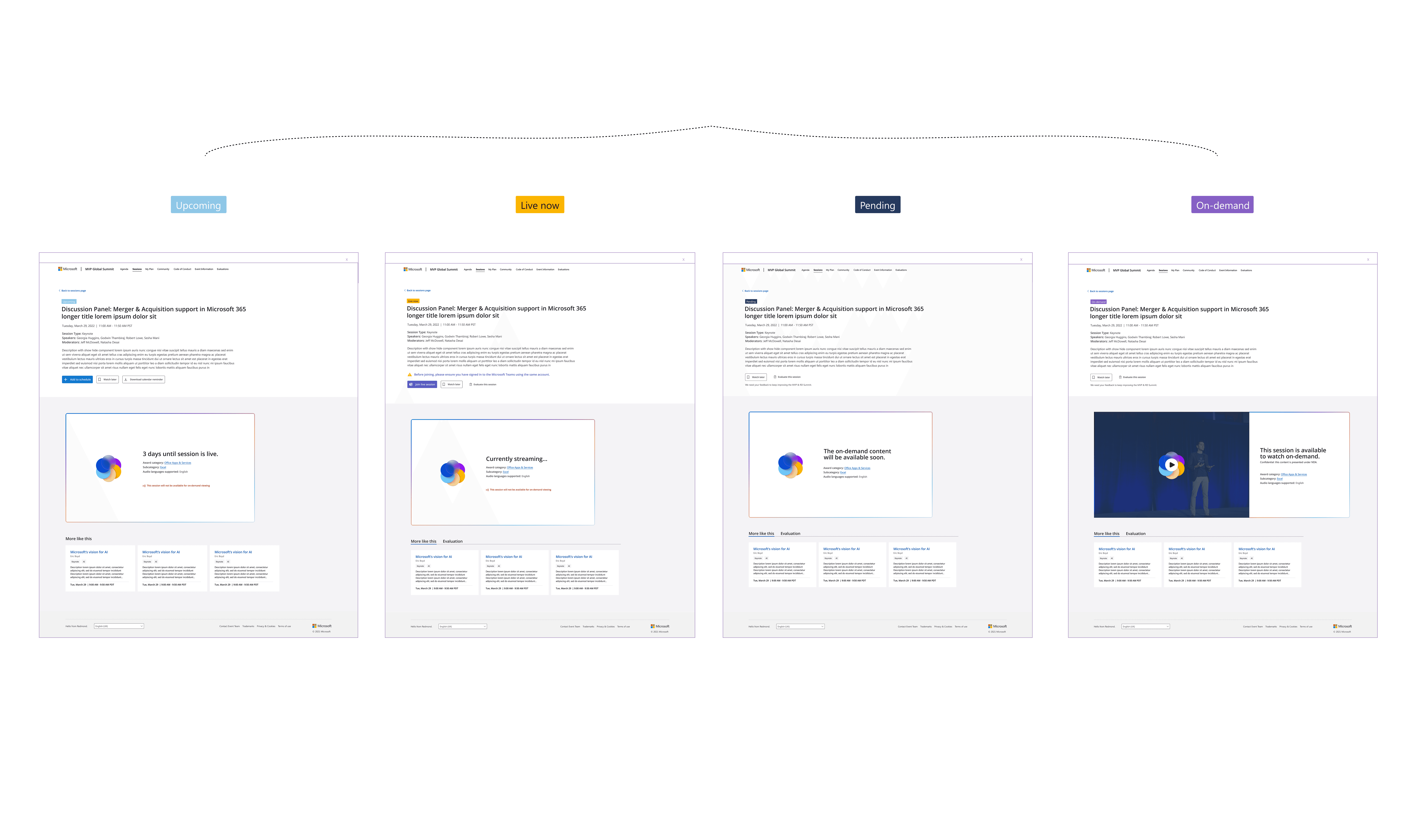
Watch Later
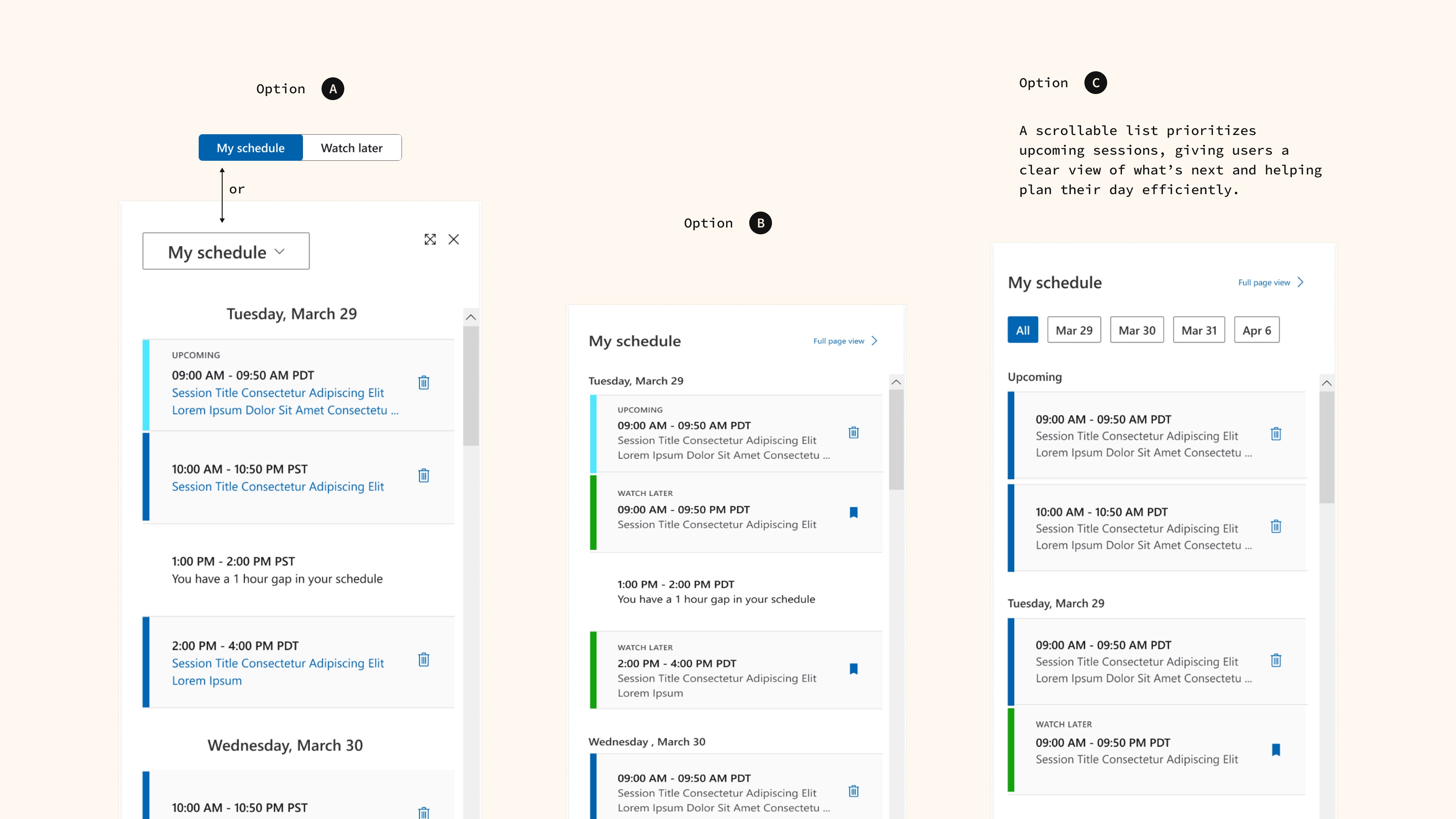
Reduced cognitive load by allowing users to save sessions and decide later.
Dropdown Filter
Added date, time, timezone, and category filters for precise, context-based search.
New Feature
Scannable Content Card
Enhanced scannability by surfacing key info upfront for quicker decision-making.
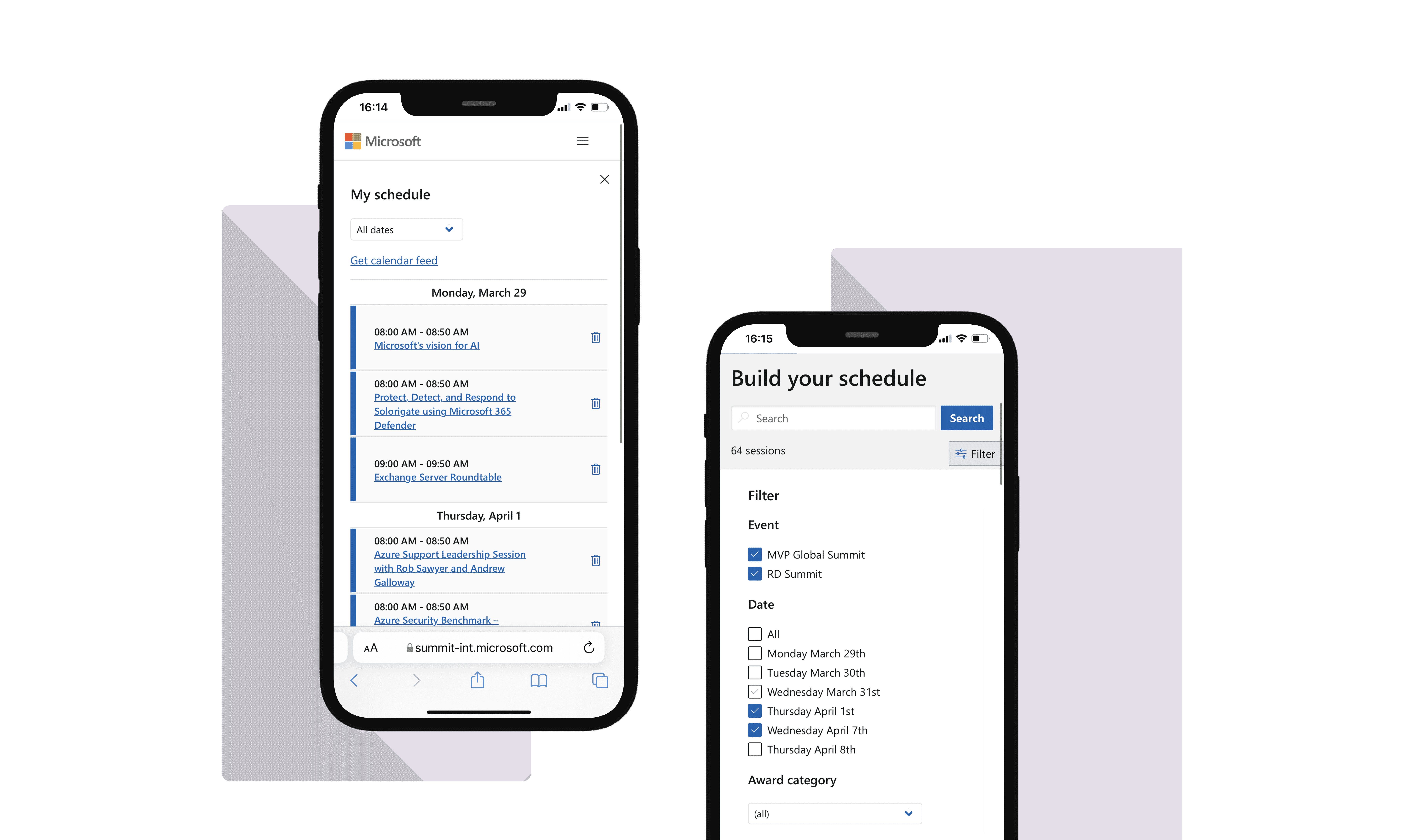
Responsive Design
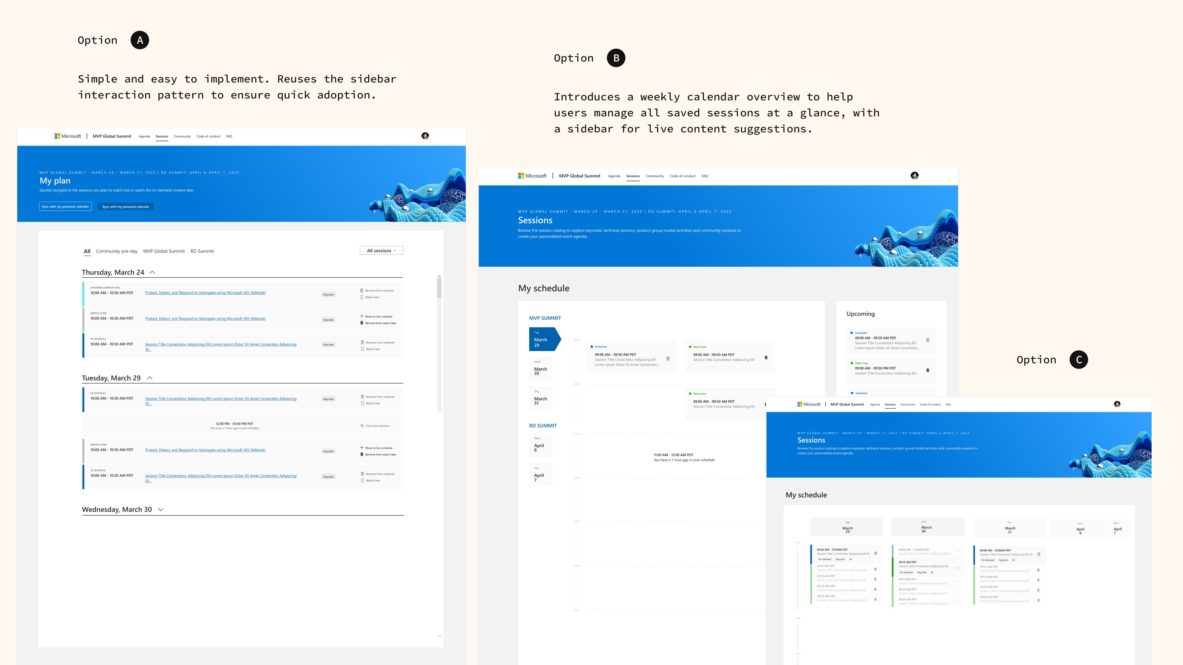
Optimized all new features for mobile to ensure a consistent multi-device experience.
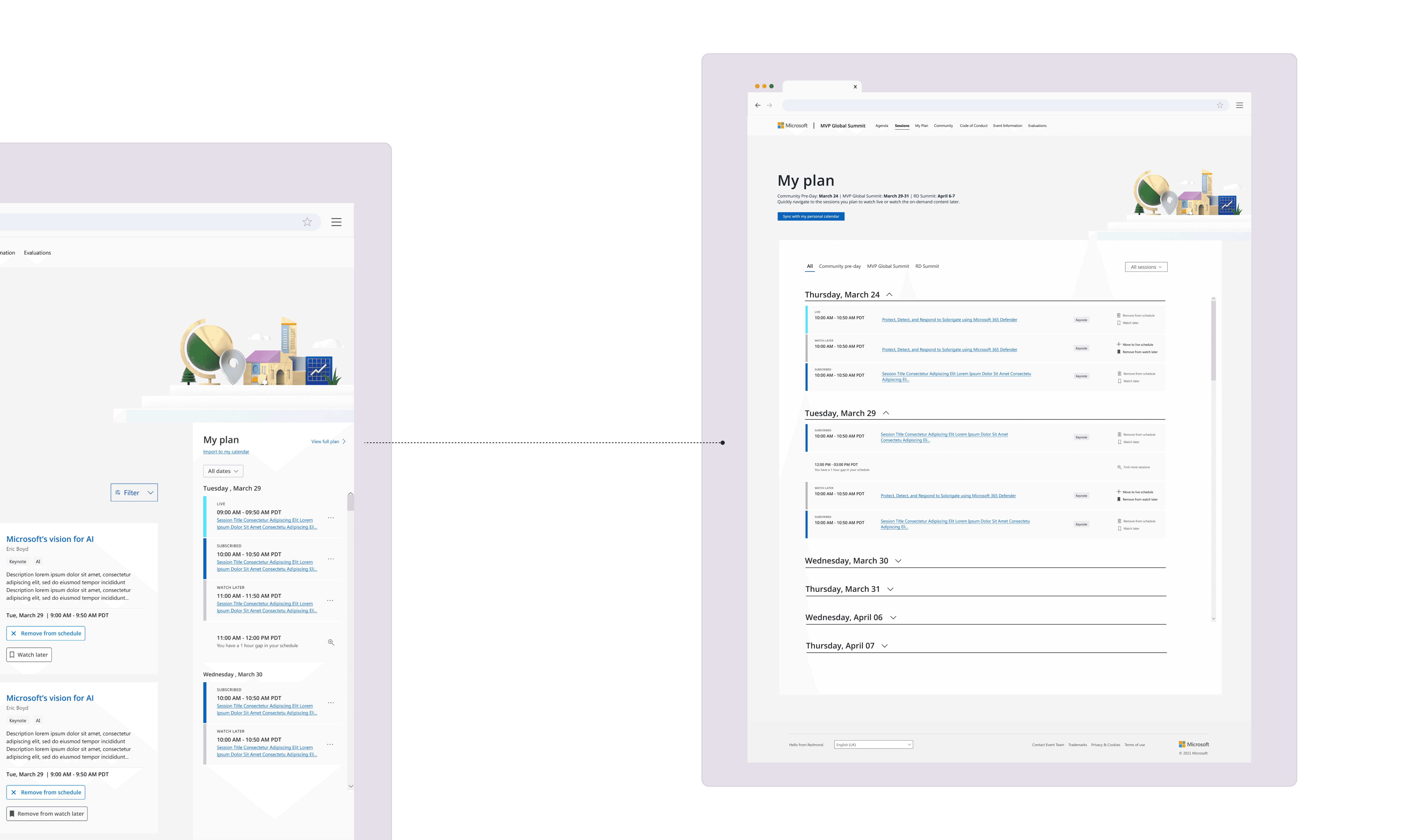
New "My Plan"
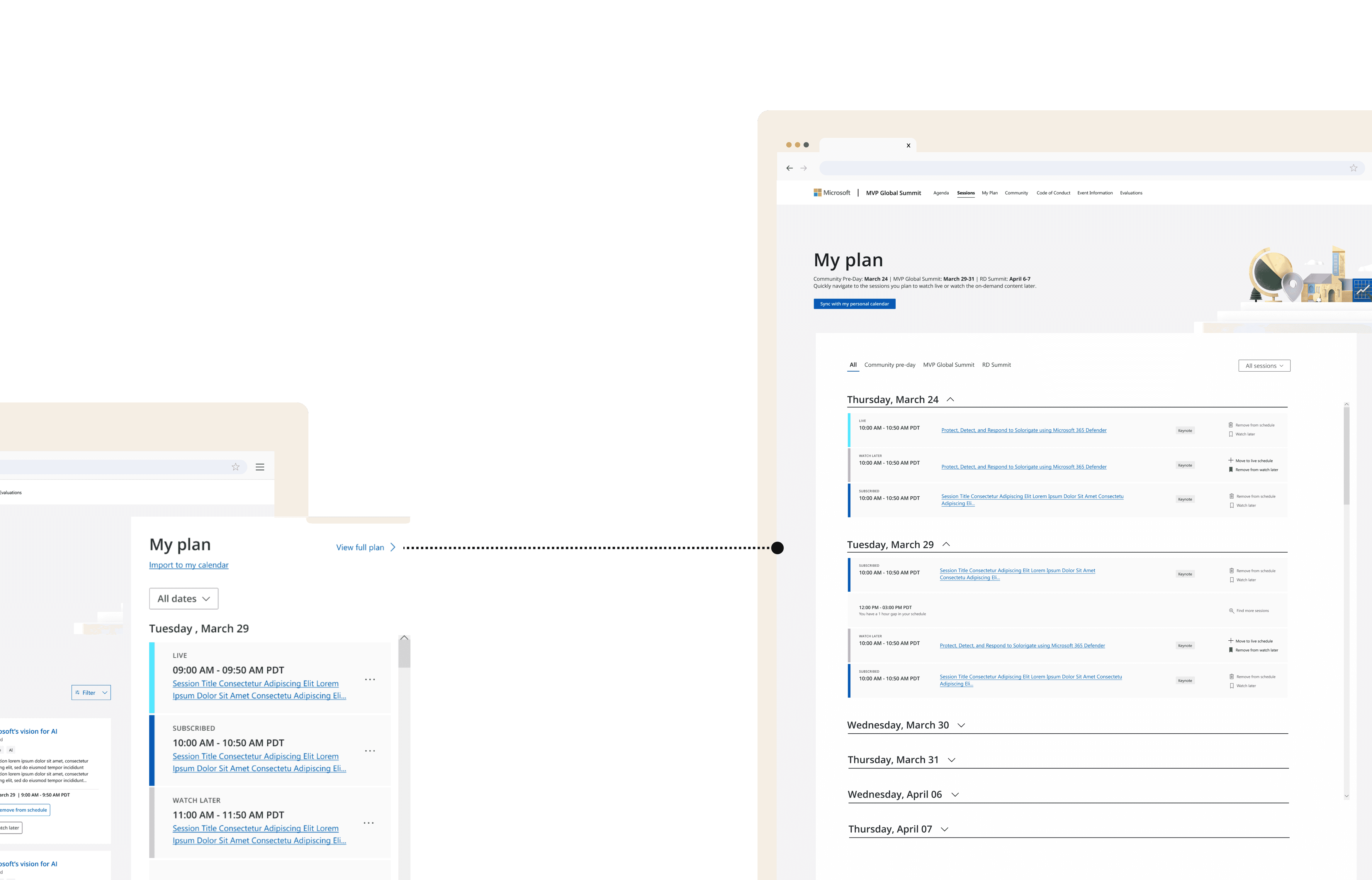
Kept a slim sidebar for quick access, and introduced a full-view mode for easier plan viewing, editing, and management.
New Feature
Watch Later
Reduced cognitive load by allowing users to save sessions and decide later.
New Feature
New "My Plan"
Kept a slim sidebar for quick access, and introduced a full-view mode for easier plan viewing, editing, and management.
Design Updates
Responsive Design
Optimized all new features for mobile to ensure a consistent multi-device experience.
Impact
Impact
Numbers | Quotes
10K+
Total sessions got saved to the new feature Watch Later list before the event started.
43%
Lift in pre-event engagement.
+4
New features successfully design and launched.
95%
Overall event satisfaction rating.
Searchable by event titles was fantastic.
New My Plan experience is nice!
Really beautiful / easy to use interface.
10K+
Total sessions got saved to the new feature Watch Later list before the event started.
43%
Lift in pre-event engagement.
+4
New features successfully design and launched.
95%
Overall event satisfaction rating.
+4
New features successfully design and launched.
95%
Overall event satisfaction rating.
Searchable by event titles was fantastic.
New My Plan experience is nice!
Really beautiful / easy to use interface.
Process
Process
Identified problem | Proposed strategies | Validated solutions
Problem Identified from Data
Many attendees joined event with empty schedules. Research revealed that their planning experience was frustrating and incomplete.
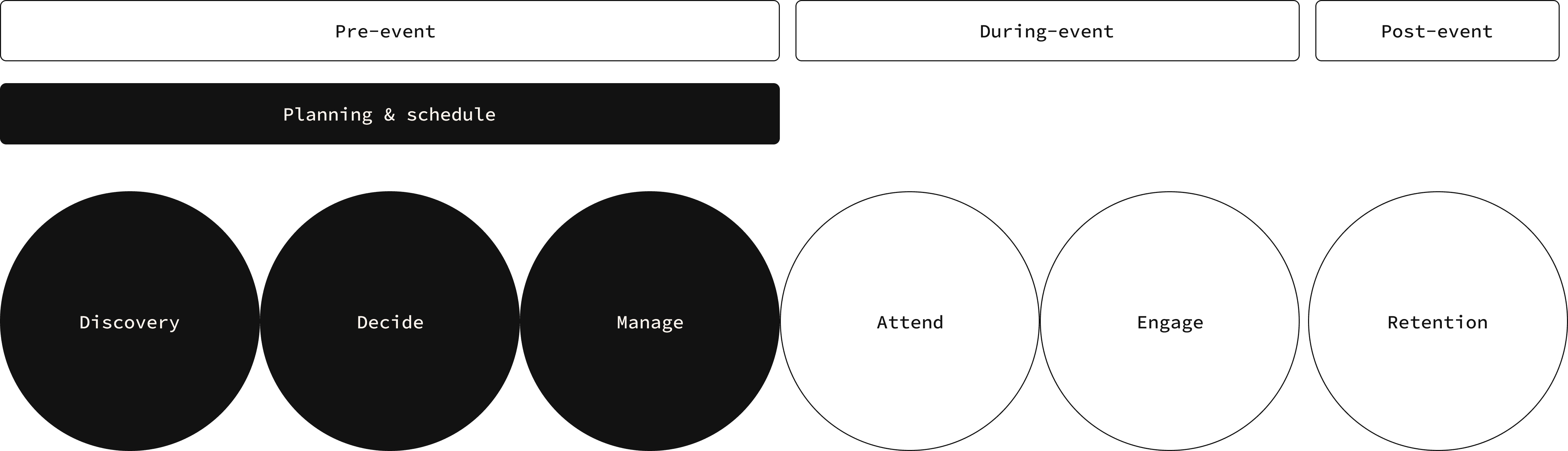
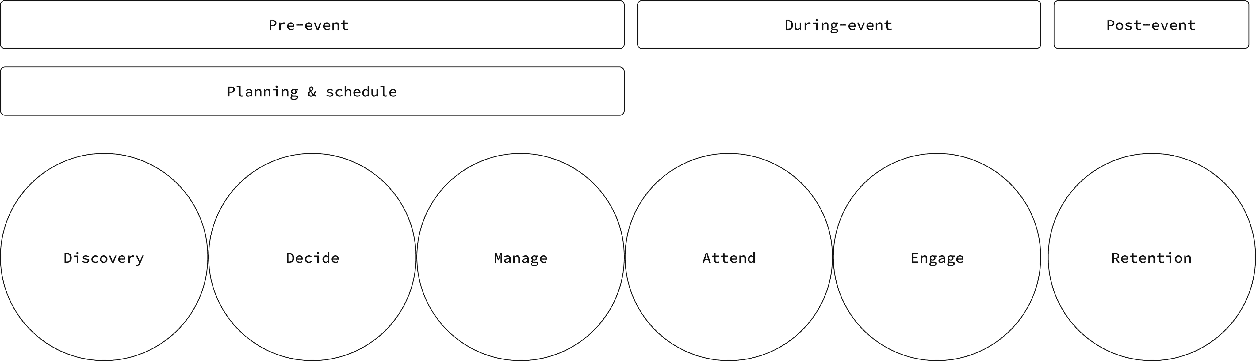
I mapped the users' planning journey, and targeted the 3 stages — Discovery, Decide, Manage — for optimization.
Many attendees joined event with empty schedules. Research revealed that their planning experience was frustrating and incomplete.
I mapped the users' planning journey, and targeted the 3 stages — Discovery, Decide, Manage — for optimization.
Pain Points and Goals
Discovery
Filters didn’t address the top pain points - time and topic.
Discovery
Filters didn’t address the top pain points - time and topic.
Decide
Large number of sessions, with many overlapping at the same time, made it hard to commit instantly.
Decide
Large number of sessions, with many overlapping at the same time, made it hard to commit instantly.
Manage
Participants could only see and manage their plan through a slim sidebar, which was extremely difficult to use.
Manage
Participants could only see and manage their plan through a slim sidebar, which was extremely difficult to use.
Manage
Participants could only see and manage their plan through a slim sidebar, which was extremely difficult to use.
Prototyping and Iterations
Discovery
Find relevant sessions faster
Decide
Reduce decision making pressure
Manage
Make schedules easy to view & edit
Discovery
Find relevant sessions faster
Prototyping and Iterations
Decide
Reduce decision making pressure
Manage
Make schedules easy to view & edit
Testing & Validation
After exploring variations for filters, tabs, and schedule layouts, I brought the designs into team reviews.
2 topics sparked the biggest debate:
After exploring variations for filters, tabs, and schedule layouts, I brought the designs into team reviews.
2 topics sparked the biggest debate:

Should we remove the sidebar entirely?
Should we remove the sidebar entirely?

Should we keep hypertabs for scannability?
Should we keep hypertabs for scannability?


Instead of going in circles, I ran quick A/B and usability testing with attendees.
The results gave us clear direction—users favored keeping a simplified sidebar and preferred hypertabs only for top-level session categories. These insights helped us align quickly.
Instead of going in circles, I ran quick A/B and usability testing with attendees.
The results gave us clear direction—users favored keeping a simplified sidebar and preferred hypertabs only for top-level session categories. These insights helped us align quickly.
Final Design & Launch
More projects