Azure.com
Time
Sep 2021
My role
Product Designer
Team
2 Product managers
Lance, Principle design manager
Tyler, Producer
Phatina, Lead designer for pricing
Dev team
Keywords
UX improvement
Global implementation
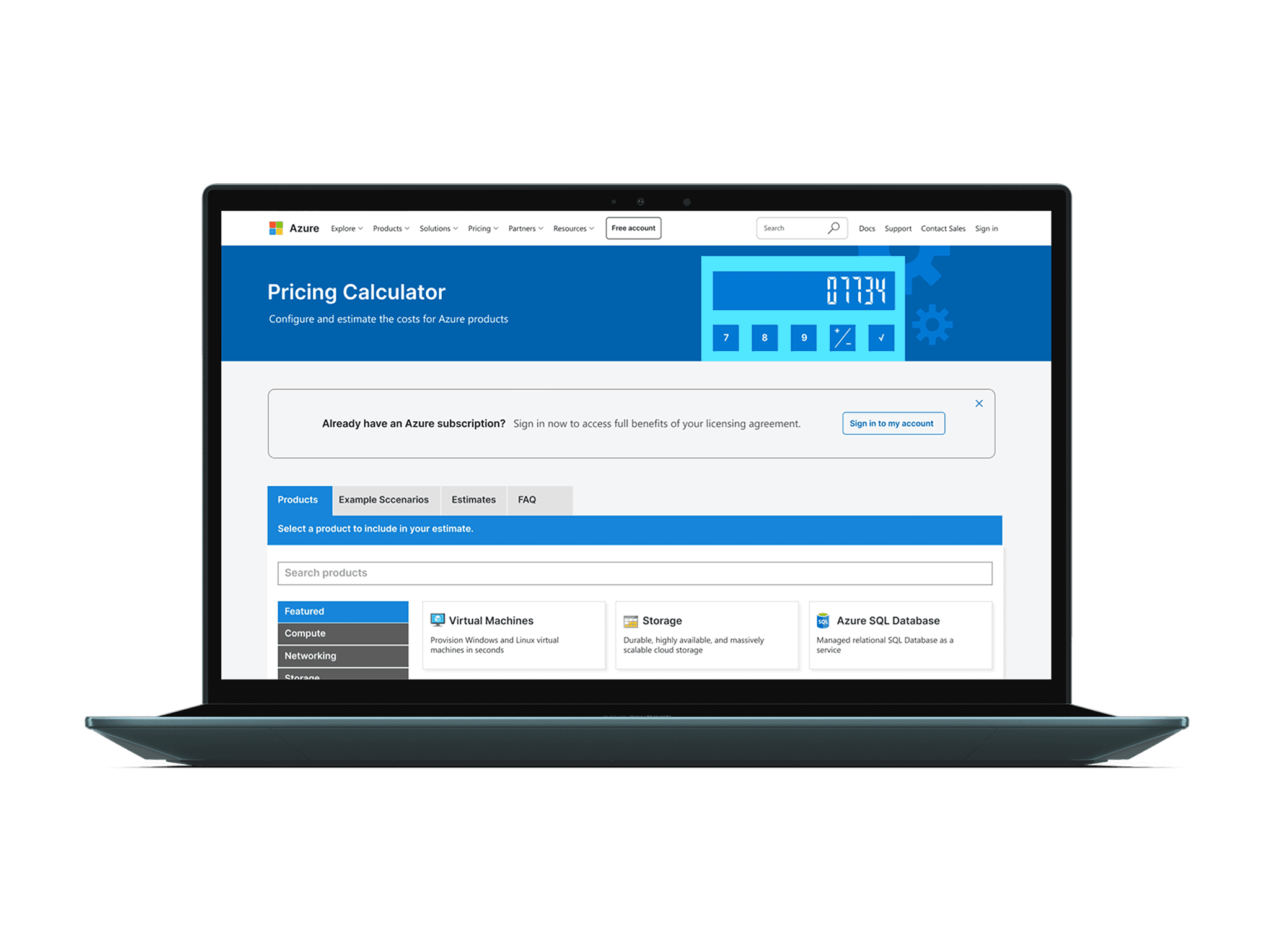
Azure users rely on the Pricing Calculator to view service costs, but many existing subscribers didn't know they needed to sign in to get pricing aligned with their licensing agreement.
This project aimed to improve the user experience by providing clear prompts and guidance.
Context
Problem statement
Many Azure subscribers were unaware they needed to sign in to access exclusive pricing, leading to user frustration, slower decisions, missed business opportunities, and reduced retention.
Impact
Positive Business Impact
Clear sign-in prompts increased access to exclusive pricing, boosting user satisfaction and retention.
Seamless Global Rollout
The design minimized localization issues, allowing for quick translation and release across multiple languages.
Maintained Engagement
By balancing the needs of various stakeholders, we created a design that preserved calculator engagement and key performance metrics.
Process
Challenge
Needed a solution ASAP!
In designing the Azure Pricing Calculator, we encountered a significant challenge:
Many existing subscribers were unaware of their exclusive pricing. This not only frustrated users but also caused the business to miss valuable opportunities to drive engagement and revenue.
As AWS and Google Cloud intensified competition, it became critical to address this gap. The challenge wasn’t just about notifying users—it was about delivering the message in a clear, non-intrusive way that aligned with usability and business objectives.
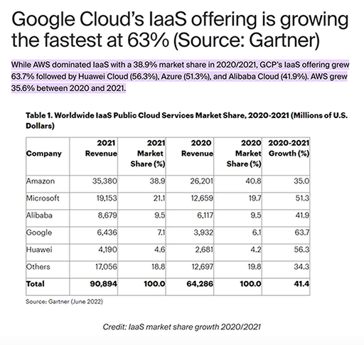
https://www.cloudzero.com/blog/cloud-computing-statistics/#:~:text=While%20AWS%20dominated%20IaaS%20with,35.6%25%20between%202020%20and%202021.
Research
Solution was straightforward?
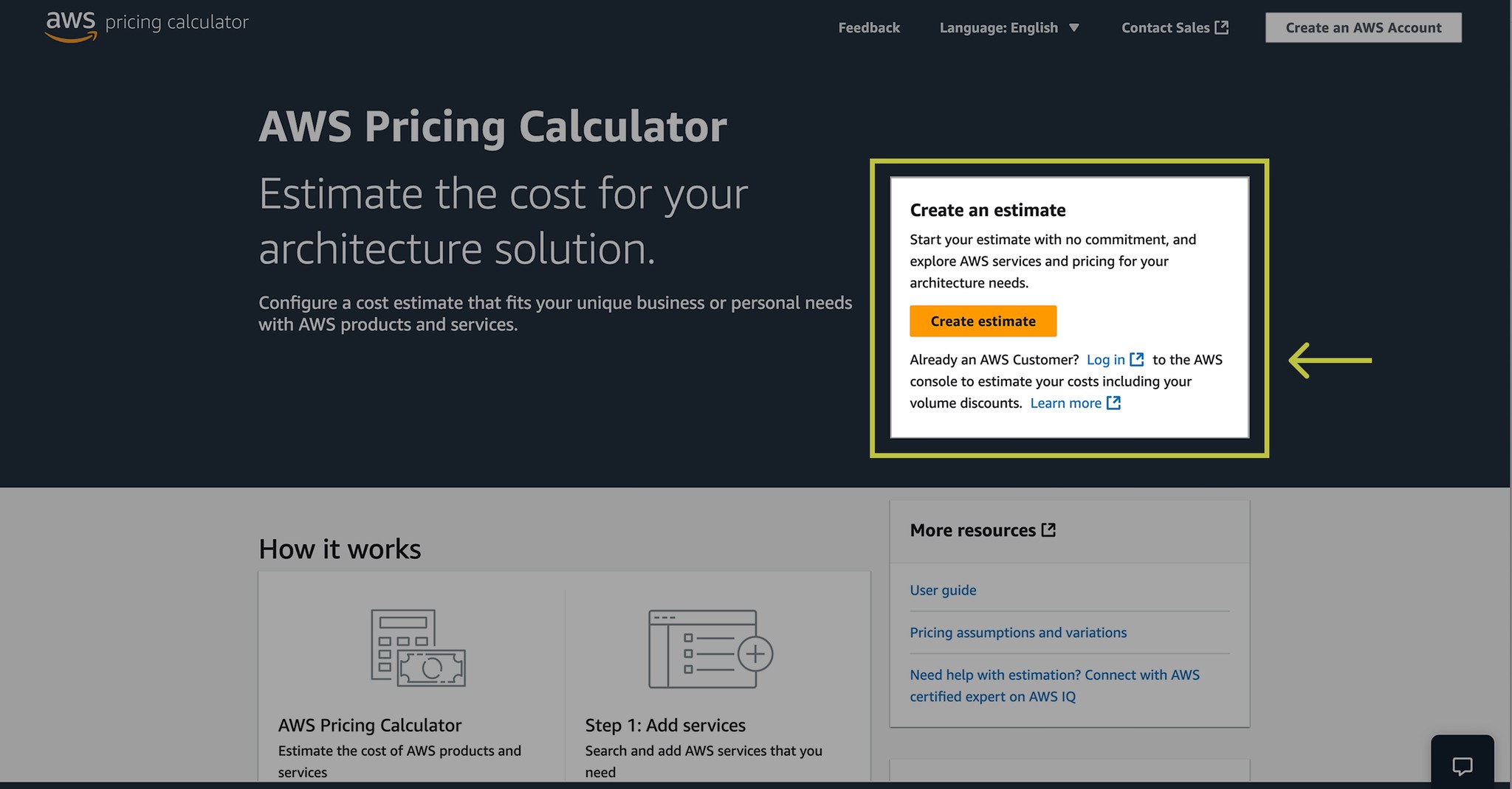
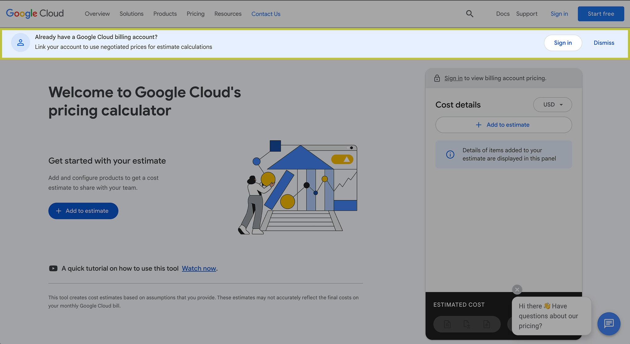
My first step was to investigate how competitors handled this. AWS and Google Cloud both displayed similar messages in their pricing calculators, using hero module and banner notification.


With these factors in mind, I needed a design that balanced clarity, usability, and global scalability while ensuring a smooth, fast implementation.
Ideate
We needed more options!
To explore more possibilities, I researched common messaging patterns and started sketching out potential ideas. Then, I met with my design manager, producer, and the lead Pricing Calculator designer to share the options, refine the strategy and together we set clear design principles:
✔ Clarity & Actionability
Users should instantly understand and act on the message.
✔ Simplicity & Scalability
The solution needed to work globally with minimal effort.
✔ Non-disruptive UX
Avoid interfering with the user’s primary task.
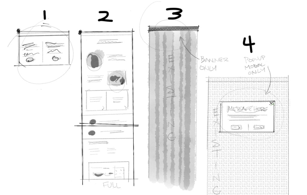
With these in mind, we decided to move forward with 4 design options:
Dedicated Page – A separate page to ensure ultimate message visibility.
Inline Message Module – Integrating the message within the pricing UI.
Banner Notification – A floating banner for visibility.
Pop up windows – Modal notification to encourage immediate action.
Prototype + Test
Users told all…
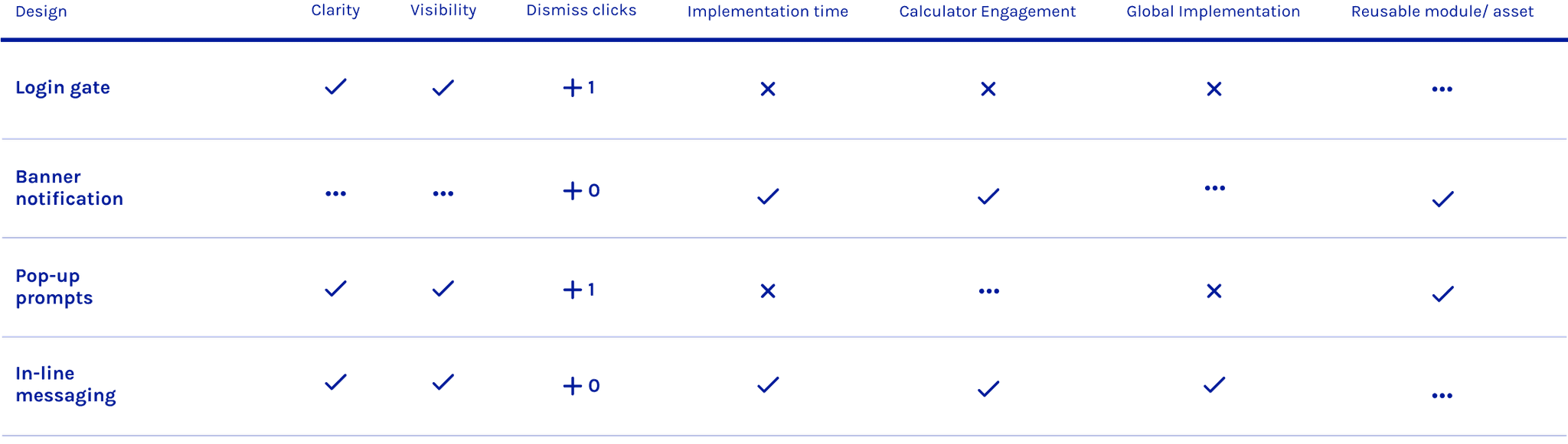
I quickly built prototypes for all four options and ran usability tests. The results revealed key insights:
Dedicated Page – “I wasn’t expecting to land on a completely different page.”
Inline Message Module – users saw the information without disrupting their task
Banner Notification – “Oh… I didn’t even notice that until you pointed it out.”
Pop up windows – Users found it distracting.
To support decision-making, I created a comparison chart evaluating each approach. The data made a strong case for inline messaging as the most ideal option.
Launch
Shipped it.
After several discussions, all stakeholders—including leadership, product, and engineering—agreed to move forward with inline messaging due to:
✅ Strong usability test results — users noticed it without feeling interrupted.
✅ Faster implementation — compared to a full-page redesign.
✅ Global scalability — easier to roll out across different regions.
✅ Business alignment — ensured subscribers got message while keeping calculator page engagement
We successfully rolled out the new inline messaging design within 2 weeks, along with a new graphic image for the header, resulting in significantly improved awareness of exclusive pricing among existing subscribers.
Thoughts
Big tech, big lessons…
Seeing my designs implemented on a global website across multiple languages and regions was a defining moment in my career. It was both thrilling and eye-opening, revealing the challenges and rewards of designing for a global audience within a large-scale organization.
🌎👩🏻💻 Designing for a Global Audience
Azure.com serves a diverse, worldwide user base, and this project taught me the importance of considering global implementation from the start. Initially, I focused on universal metrics, only to realize that success varies across regions due to local regulations, cultural nuances, and technical differences. Metrics need to be adaptable and inclusive to have a meaningful impact, while also respecting local needs.
🙋🏽♂️🙋🏼♀️ Navigating Stakeholder Priorities
Working with multiple teams revealed a key insight: every stakeholder has unique KPIs, and these priorities don’t always align. While this created some tension, it also highlighted the importance of balancing trade-offs to find solutions that work for everyone.