MVP & RD Summit 2022
Time
Jan 2022 - Mar 2022
My role
Lead Product Designer
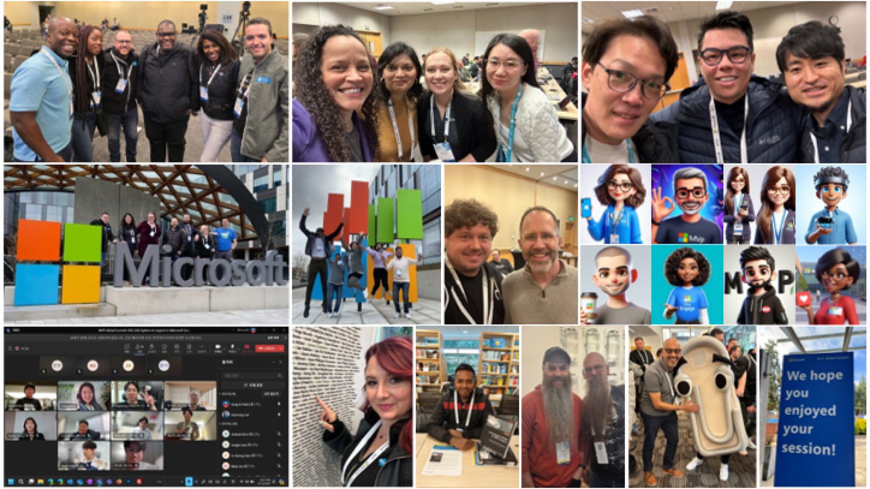
Team
1 Principal PM manager
2 Event program managers
1 Producer
1 3D graphic designer
Dev team
Keywords
Design Strategy
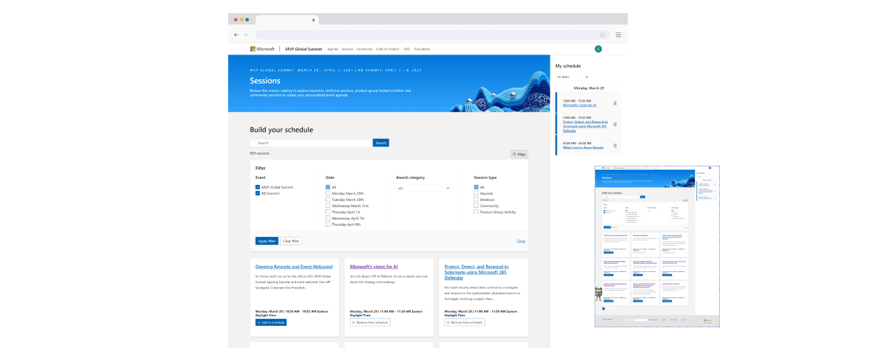
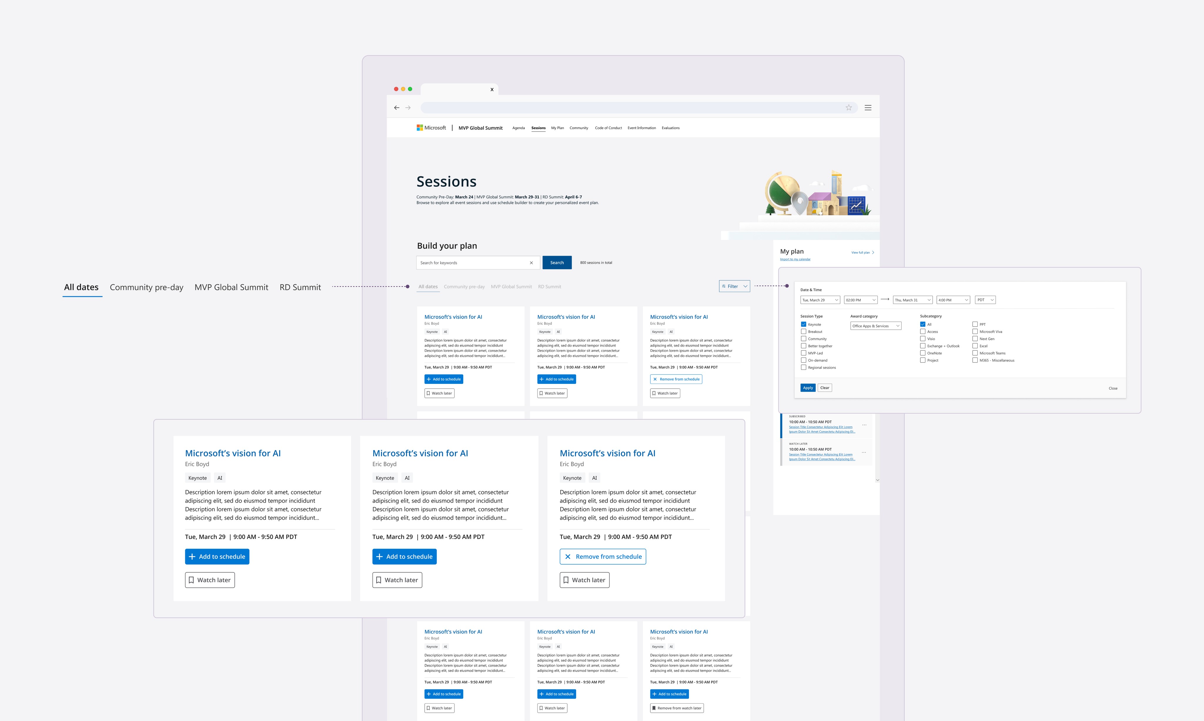
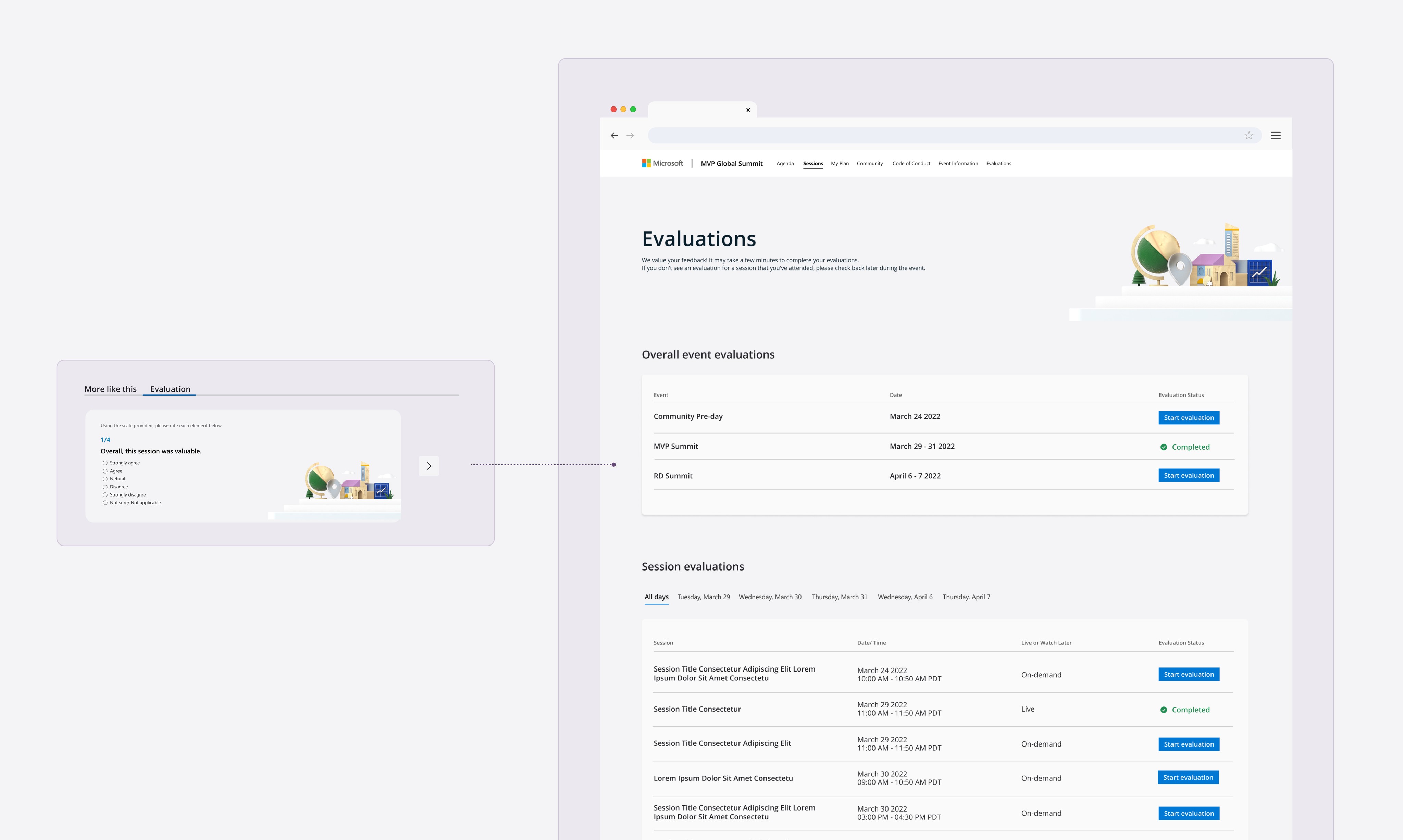
Schedule builder is an event planning tool for Microsoft annual conference, MVP & RD Summit. It helps users to plan and manage their schedule for the event.
My responsibility in this project is to optimize navigation, reducing friction so attendees can plan without frustration or abandoning the process.
Due to NDA restrictions, I’m only able to share mockup screens. Real session titles, speaker names, and detailed content have been removed to protect confidential event information.
Background
Problem statement
User pain points
Hover to see detail
Impact
Kickoff
Big challenges, tight timeline.
This project kicked off with an 🆘 from the PO because the previous designer couldn’t make it. So, I jumped in as the new designer—first timer and last-minute!
During the kickoff meeting, the major challenge surfaced:
Many attendees joined the Summit with an empty schedule.
Understand
But, why is that?
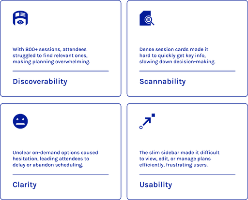
My first priority was to identify why attendees struggled with planning. I analyzed the existing product, reviewed past survey data, and gathered insights from previous attendees.
Through this research, I uncovered key pain points and mapped out the their journey to clarify the difficulties they faced while using the schedule builder.
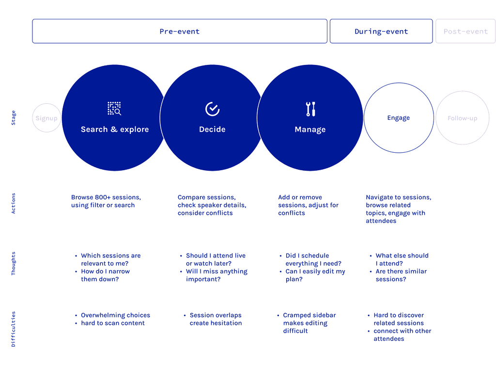
With these findings in hand, I asked:
Ideate
Turning research into actionable design.
Based on my research, I broke down the problems and shared my findings with the producer and stakeholders (luckily, they agreed it made sense!) With those insights, I also pitched my design strategies and solutions.
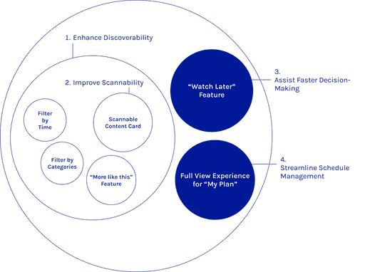
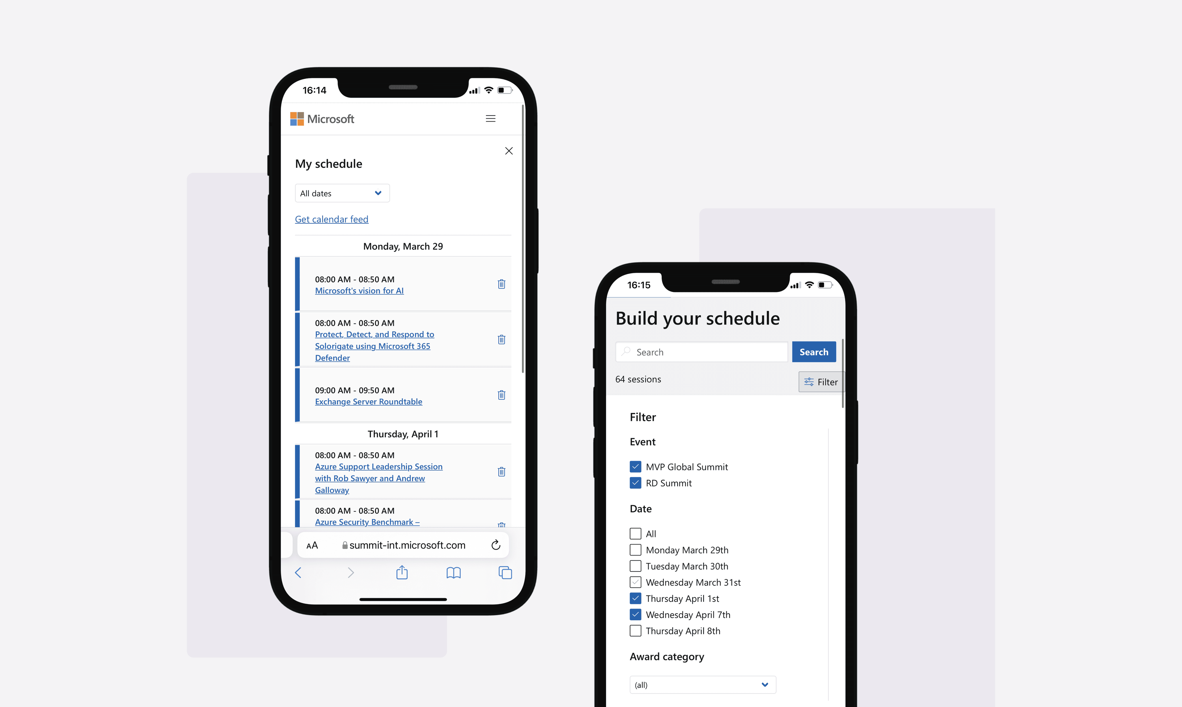
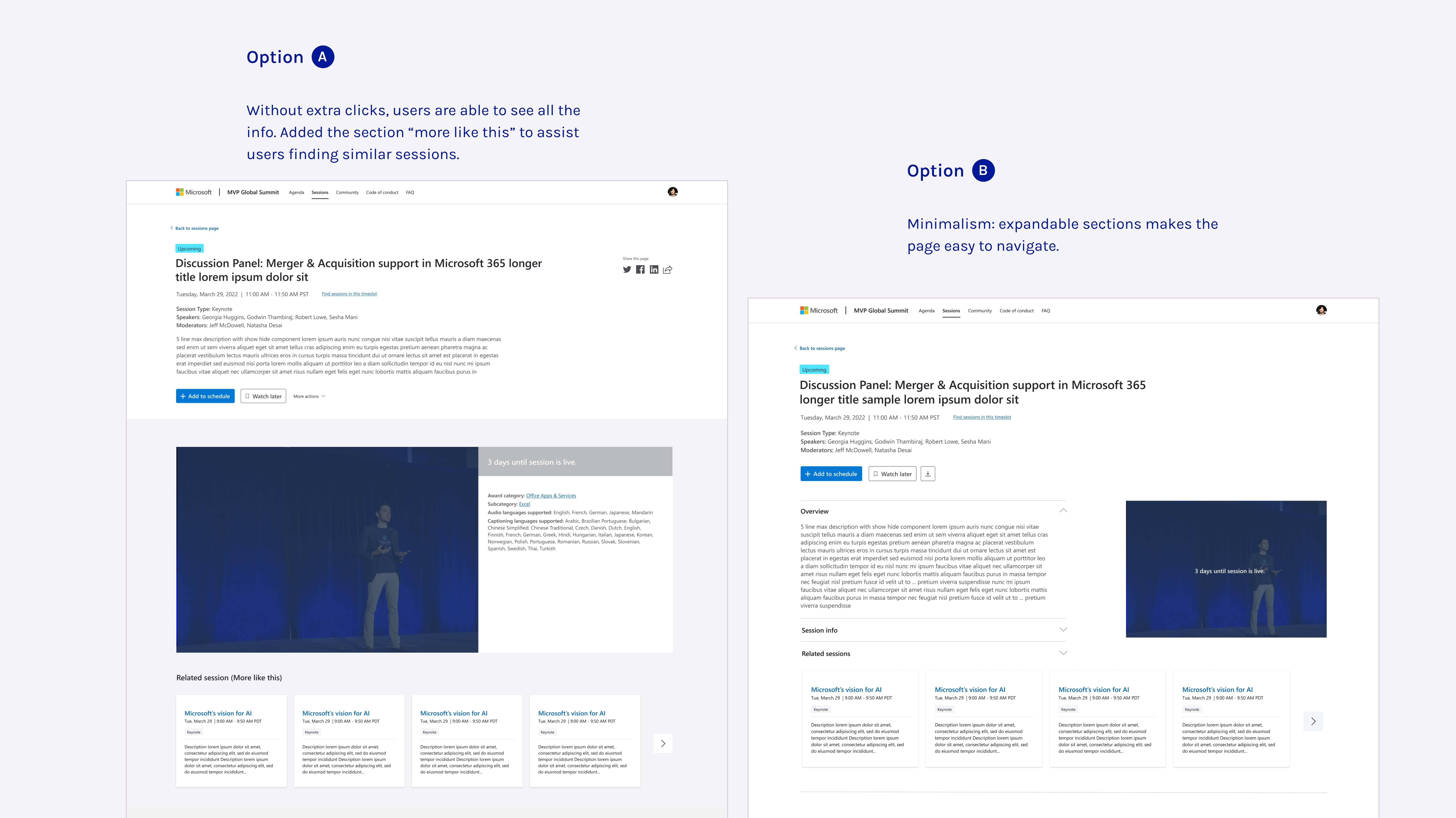
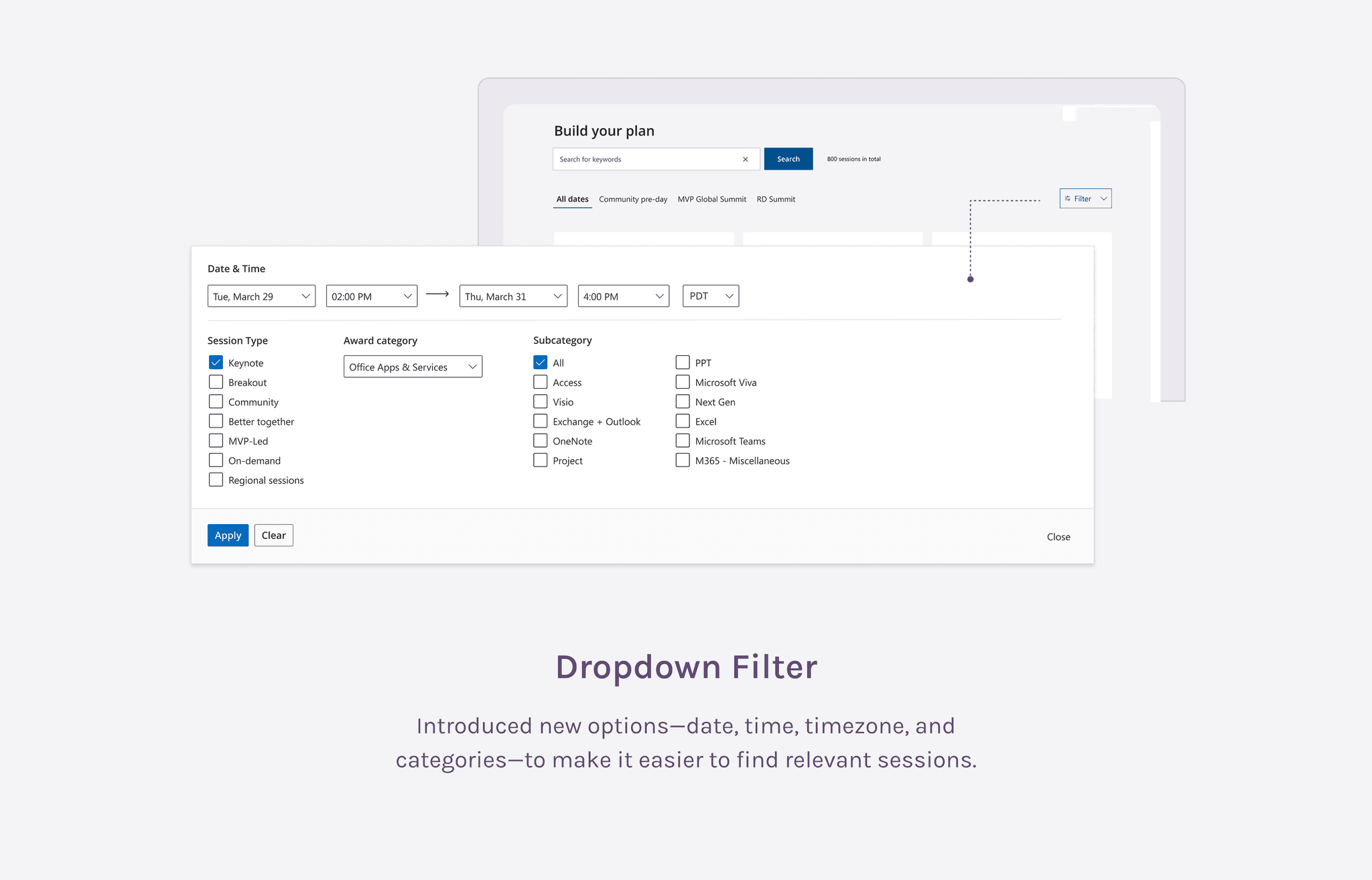
Enhance Discoverability
Make it easier for users to find relevant sessions through improved filtering and categorization.
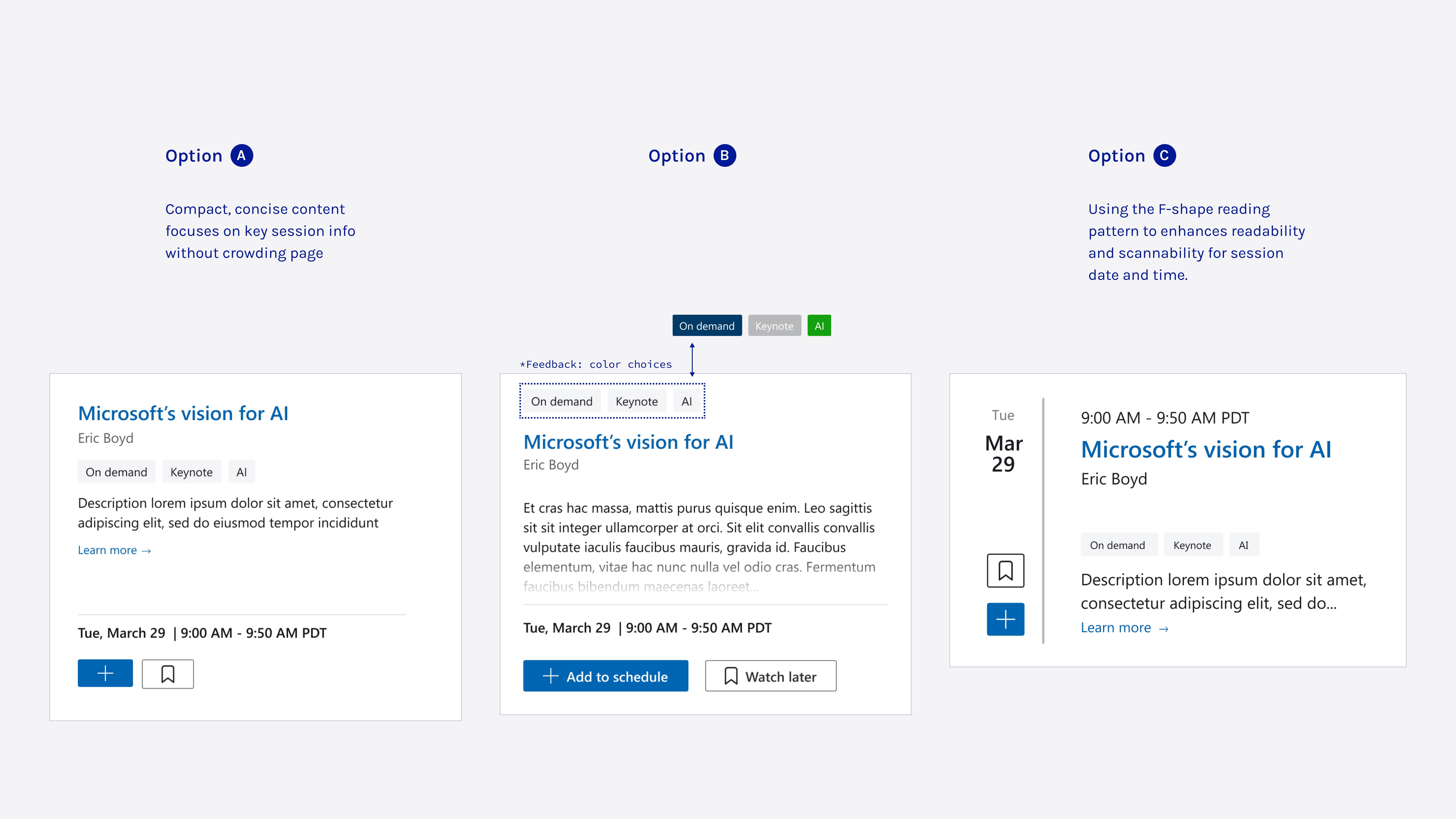
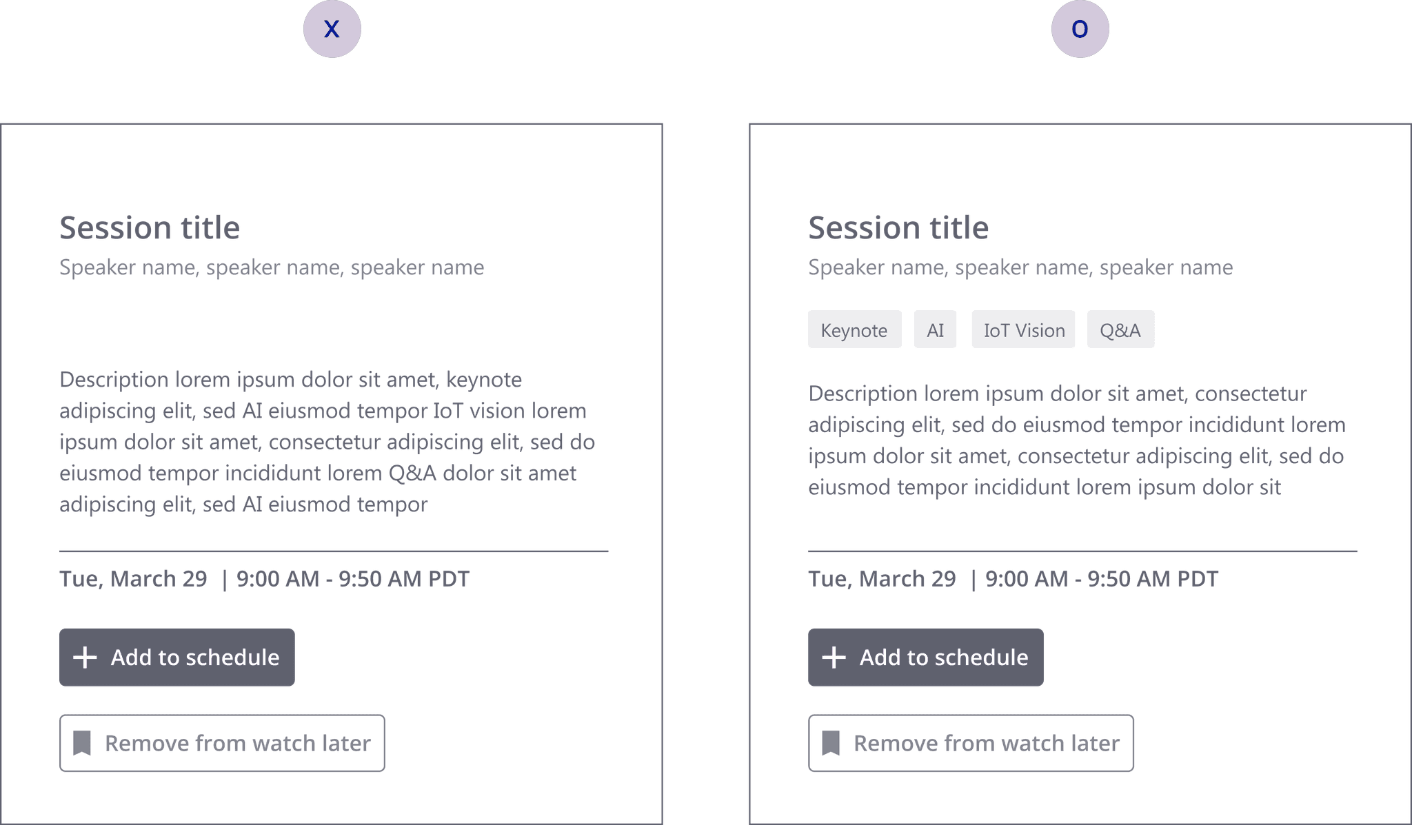
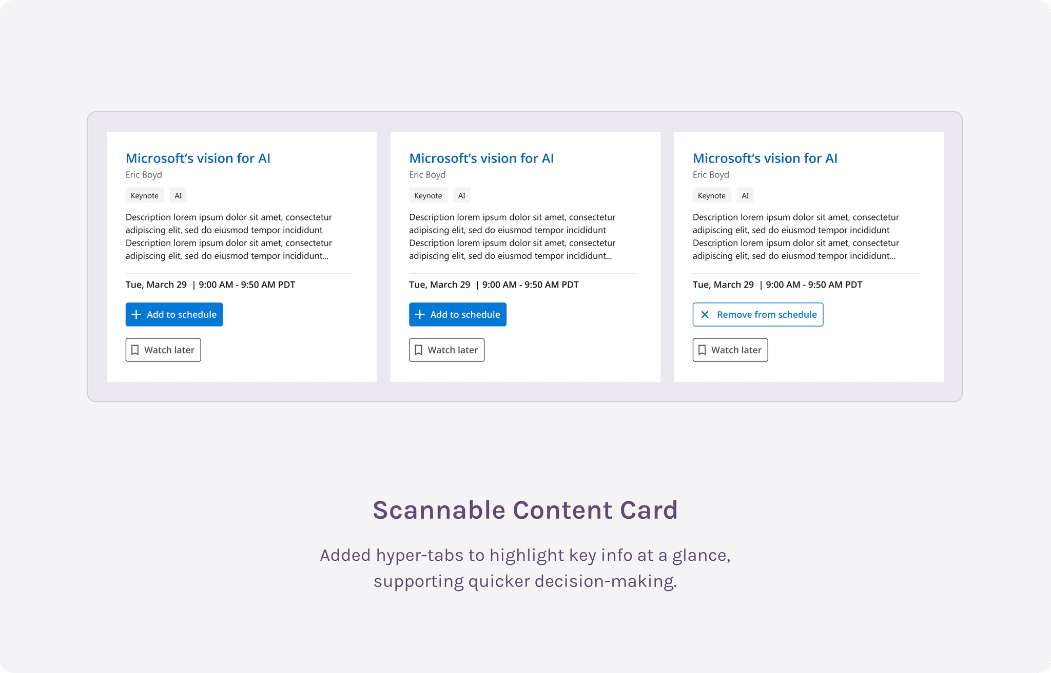
Improve Scannability
Design session cards for better readability, allowing users to quickly grab key info.
Assist Faster Decision-Making
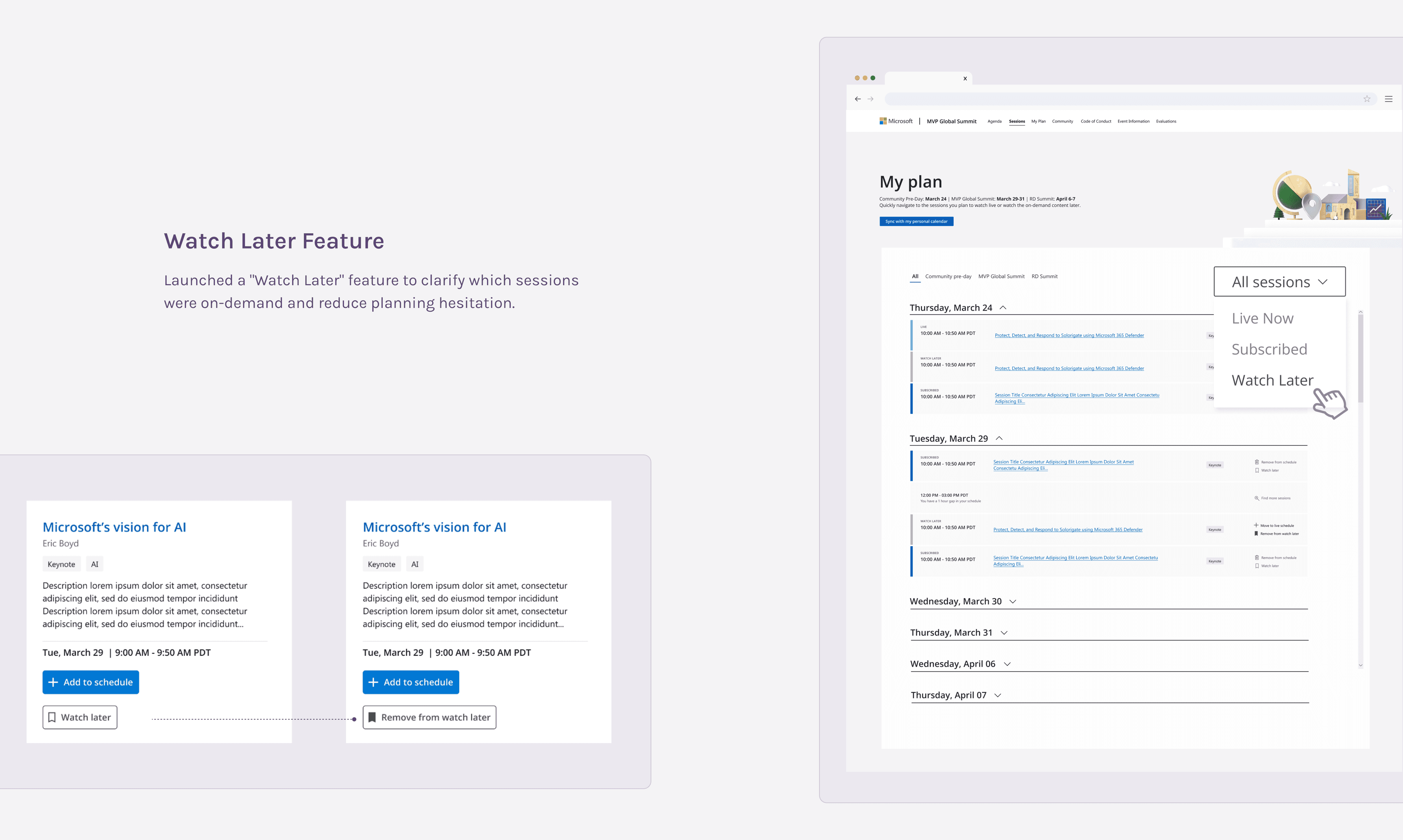
Introduce features like "Watch Later" to reduce hesitation and streamline session selection.
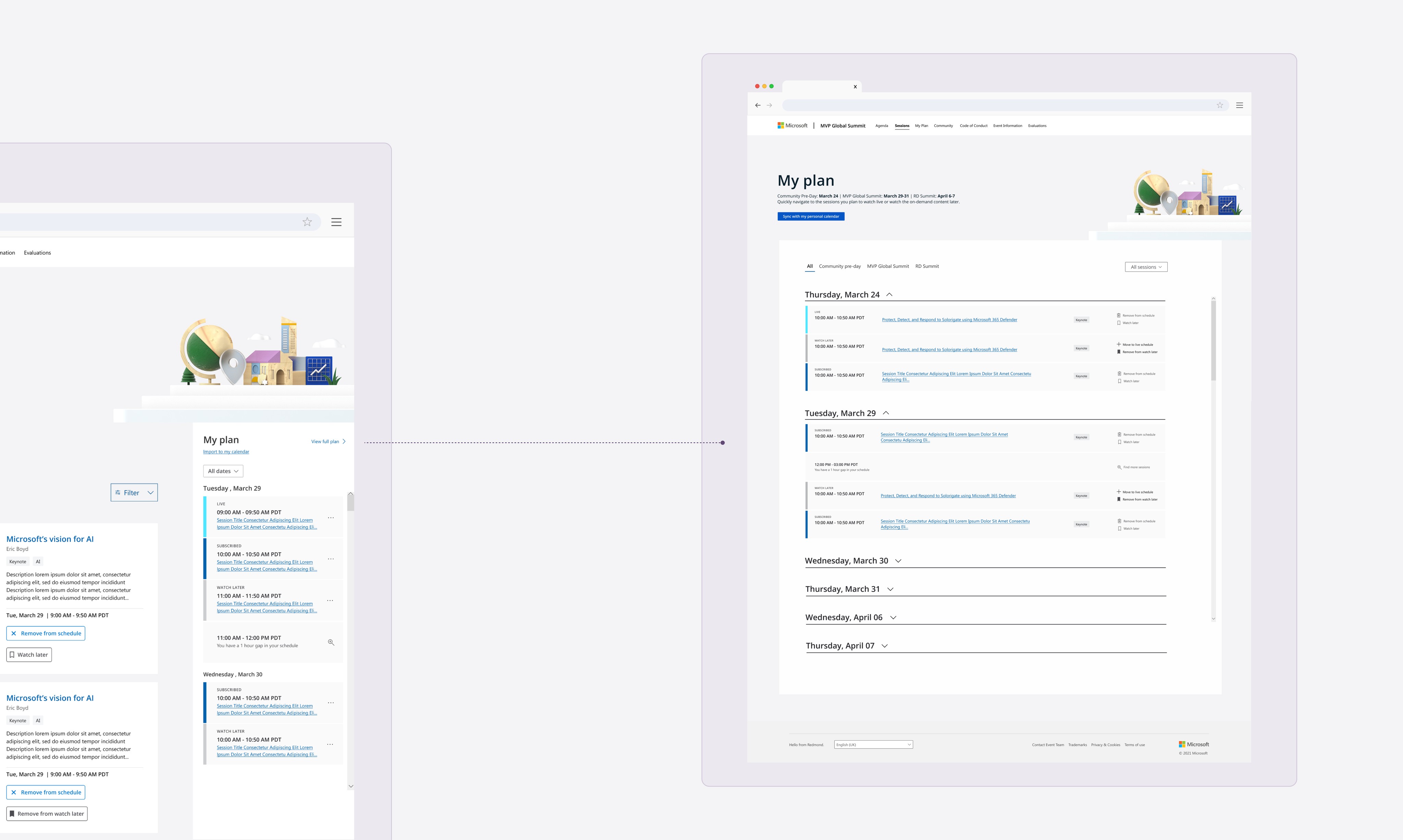
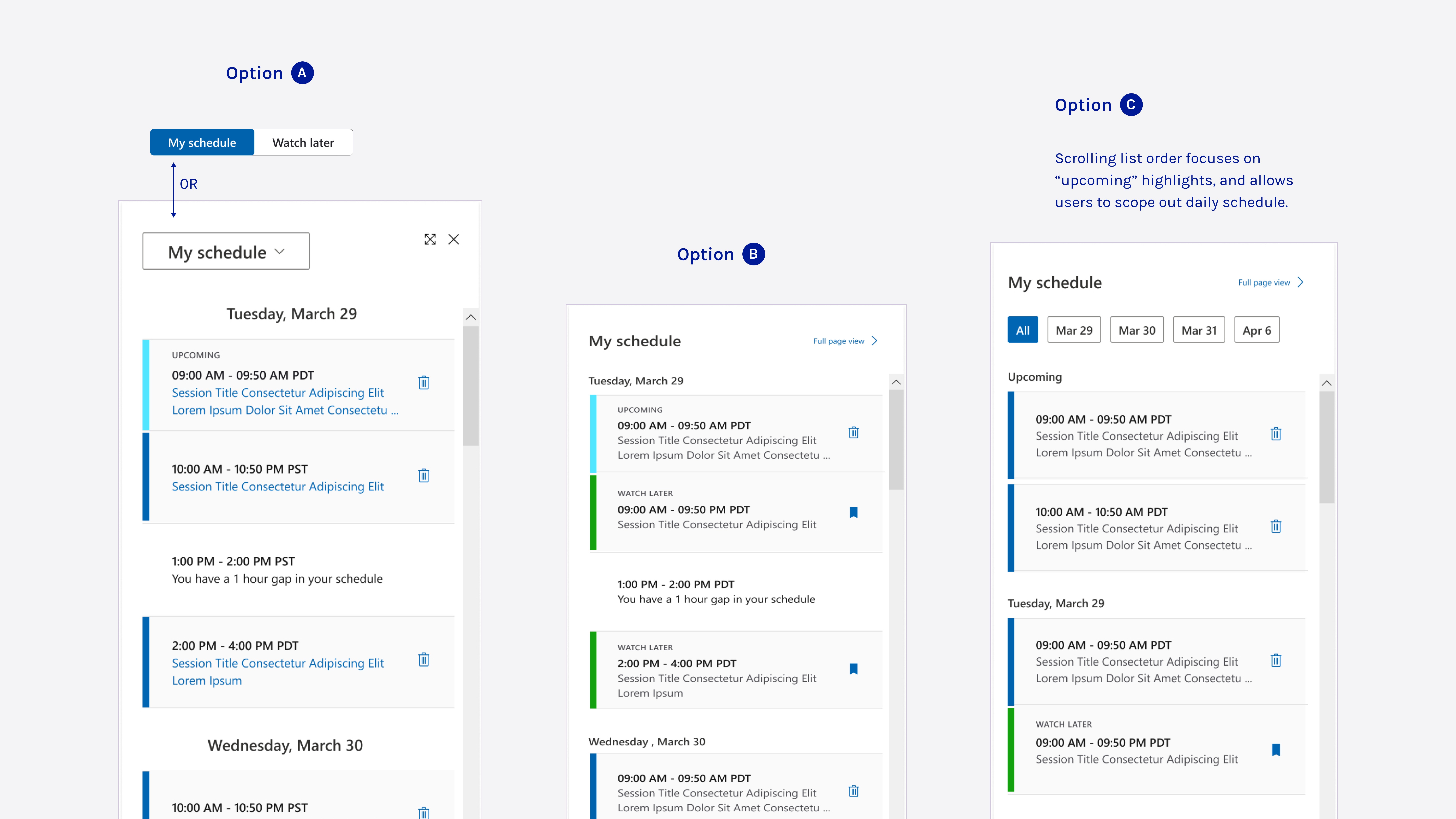
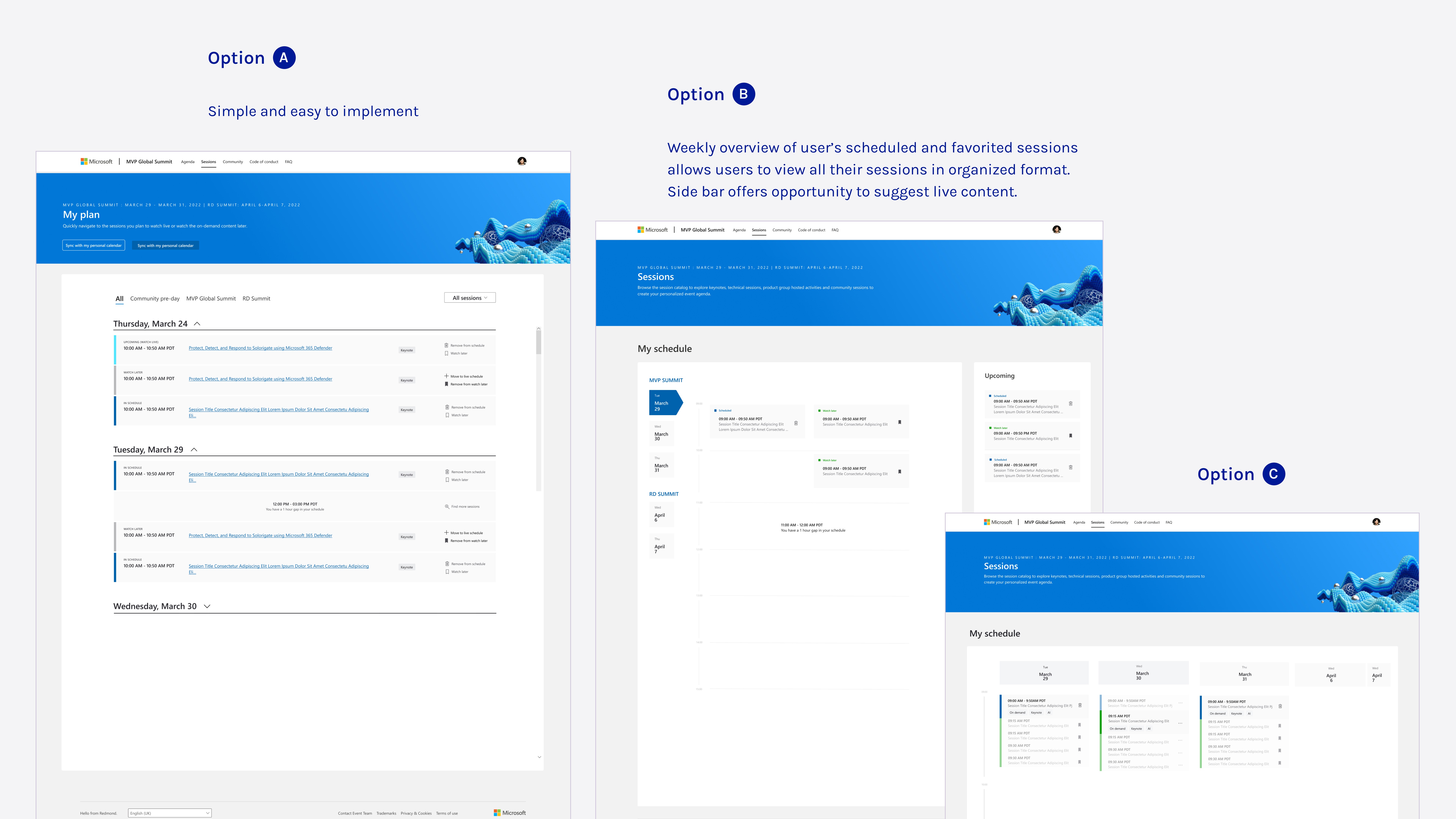
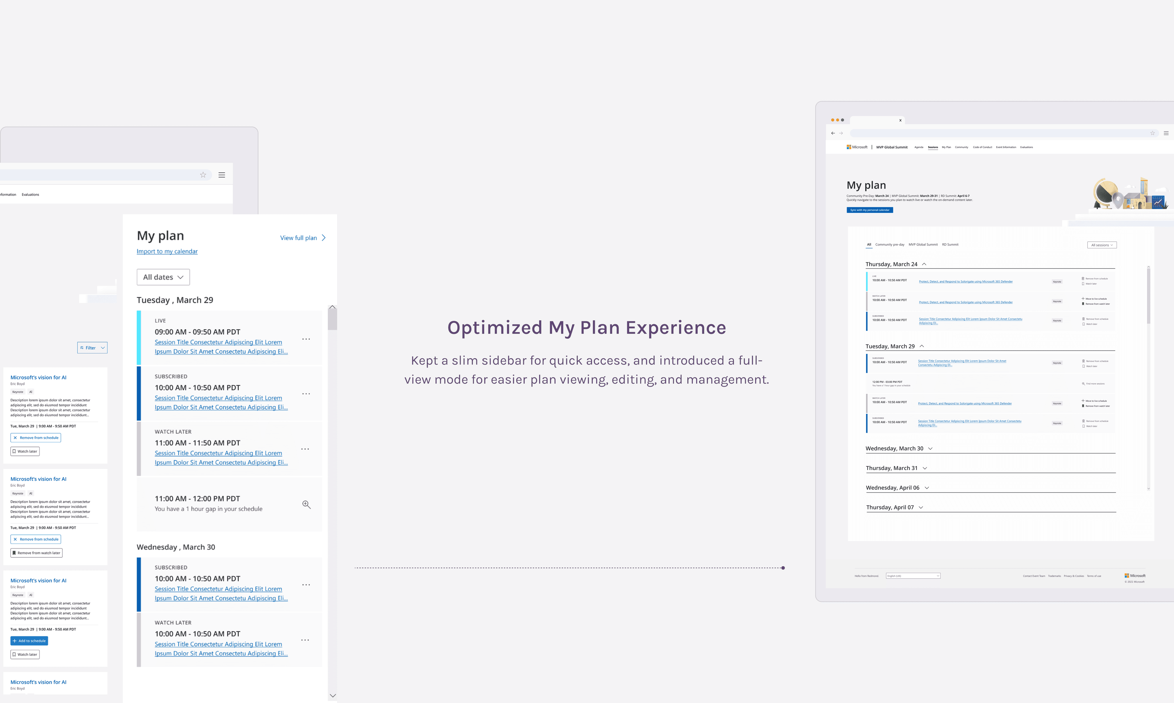
Streamline Schedule Management
Create a full view "My Plan" experience to simplify adding and removing sessions.
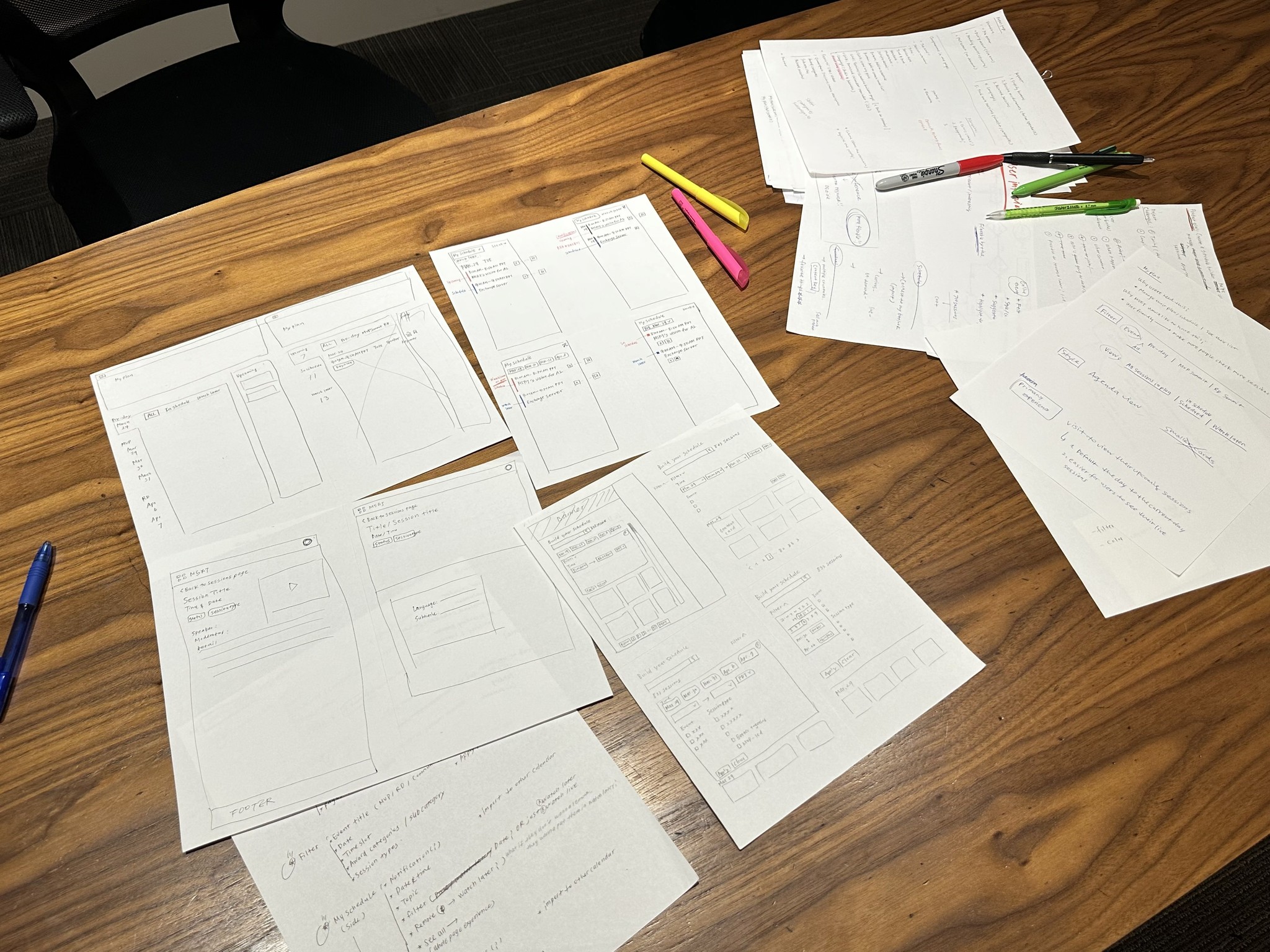
Prototype + Test
The road to better ideas.
With these strategies in mind, I sketched out some ideas and created the prototypes. I took the initial designs to a brainstorm and review session with my design team, where we bounced around ideas, feedback, and a few critiques.
Iterate
Prototype reality check!?
Based on feedback from the critique meeting with my design team and my sketches, I refined and built the design using the design system and new style palette, ensuring it was ready for the stakeholder review.
I thought I nailed it… but design is all about iteration. Here’s what came up…
Issue 1 — Sidebar love
To better assist users, I proposed replacing the sidebar planner with a full-screen "My Plan" view. Stakeholders valued the sidebar for quick browsing of scheduled sessions, so they weren’t on board with replacing it.
x

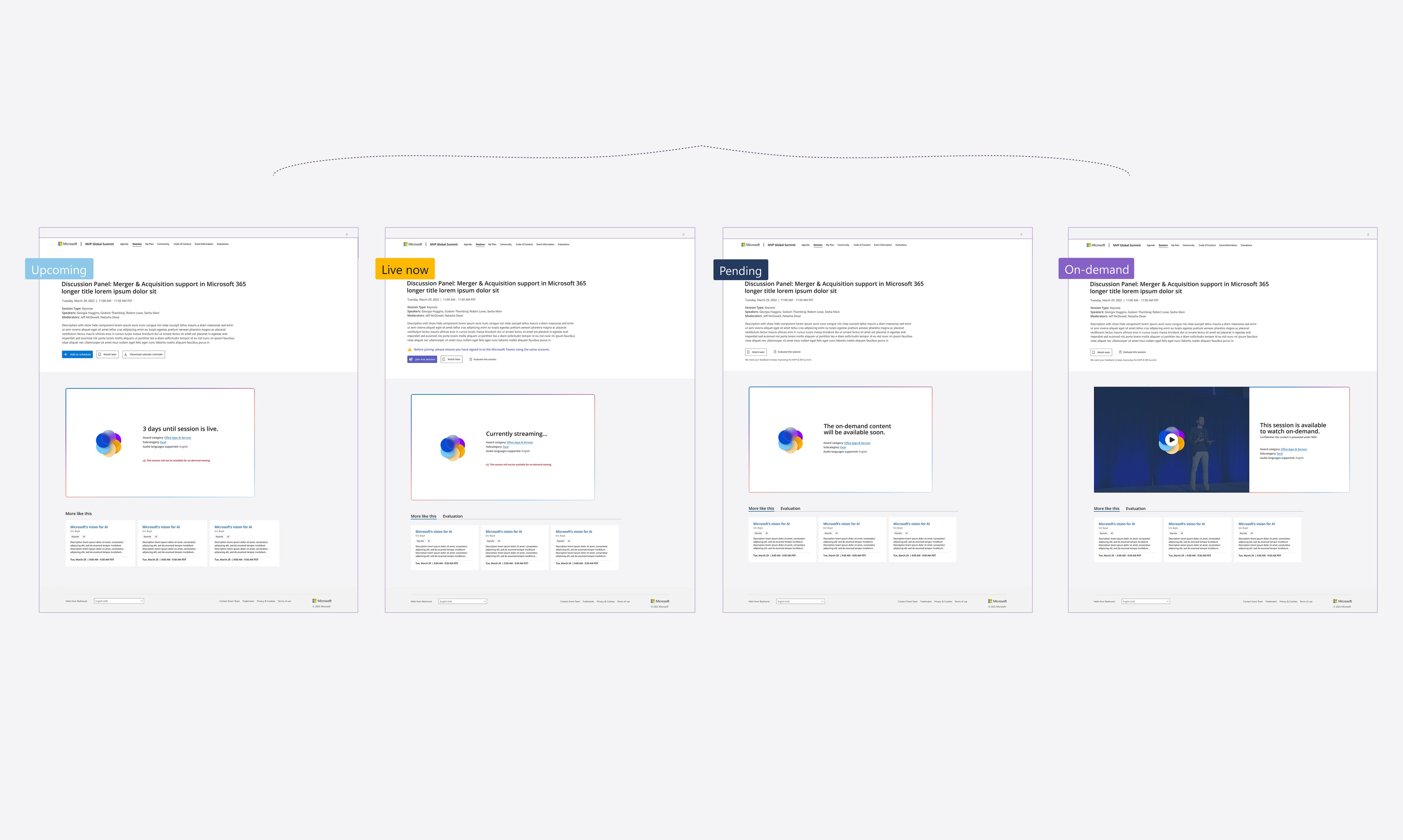
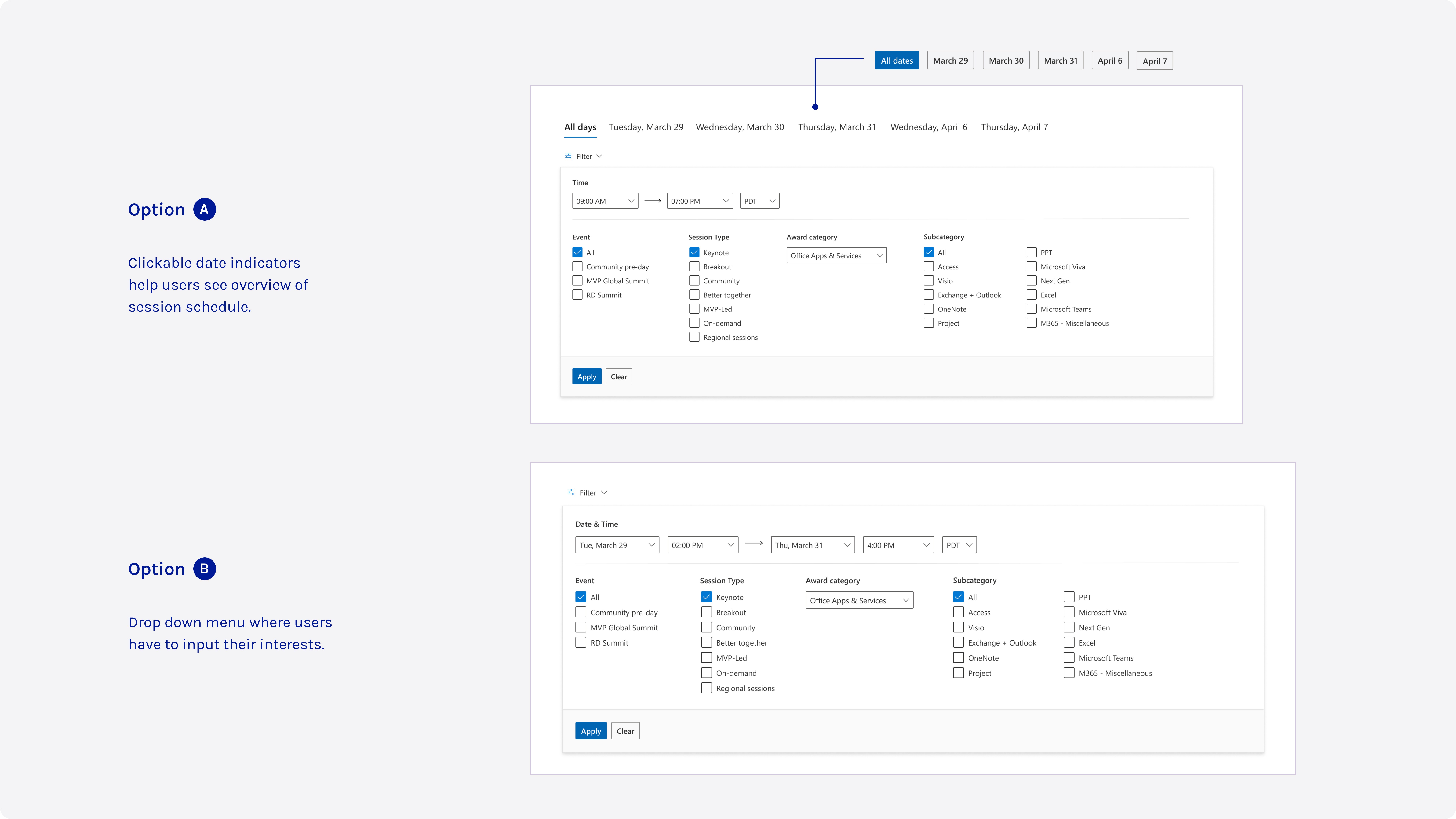
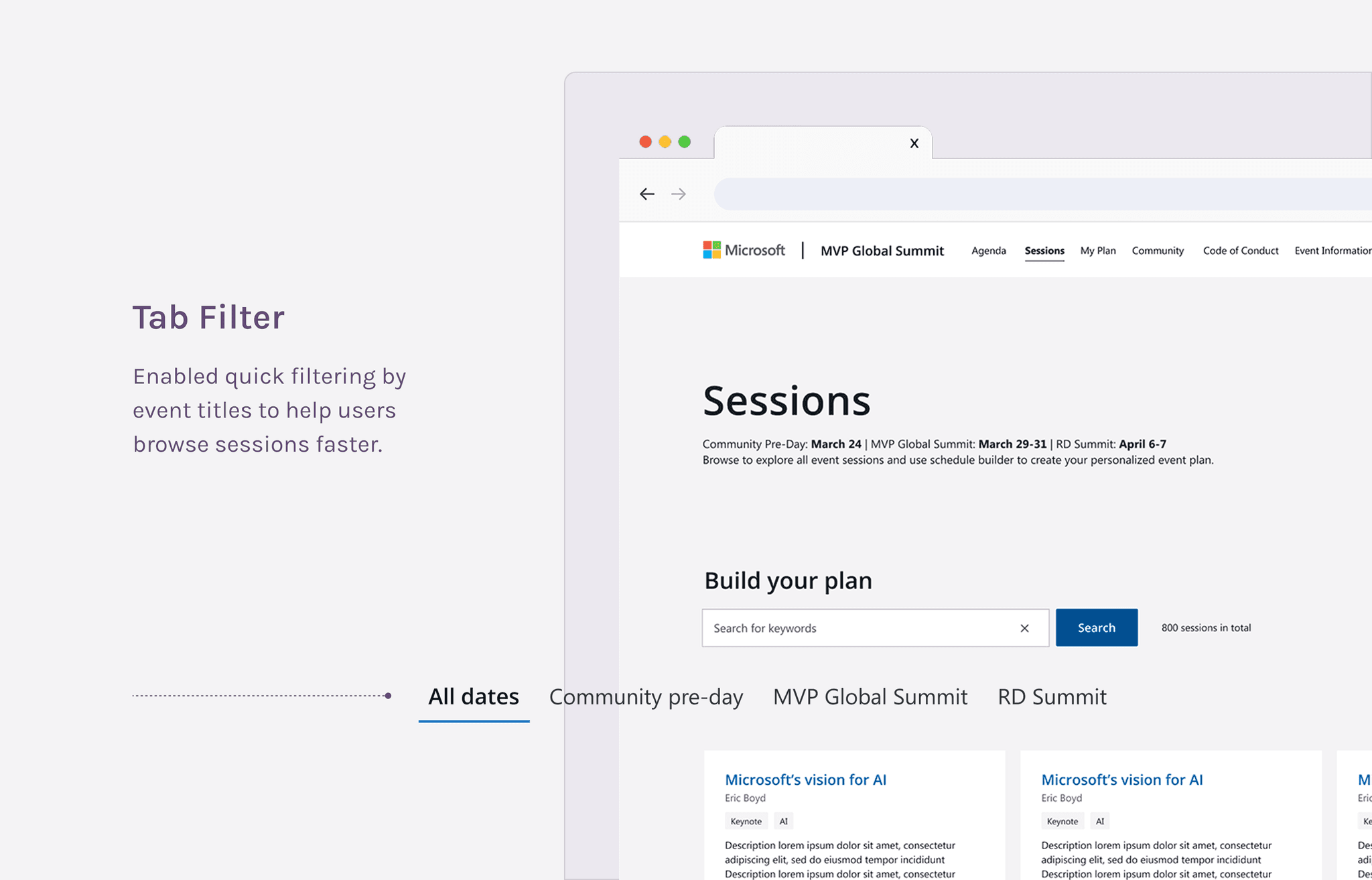
Issue 2 — Hypertab struggle
Based on previous years, many speakers couldn’t confirm session details before the conference started, making it impossible to make the tabs clickable. However, I still recommended keeping them, muting the colors to maintain their scan-friendly benefits.
Using greyscale testing to show that hypertab improved scannability, helping users quickly grasp key session details—essential for navigating 800+ sessions efficiently.
MVPs
Priorities in check!
After multiple discussions and considering time constraints, we prioritized key features as MVPs. These targeted improvements significantly eased navigation challenges, helping attendees plan better and avoid arriving with an empty schedule.
Achievement
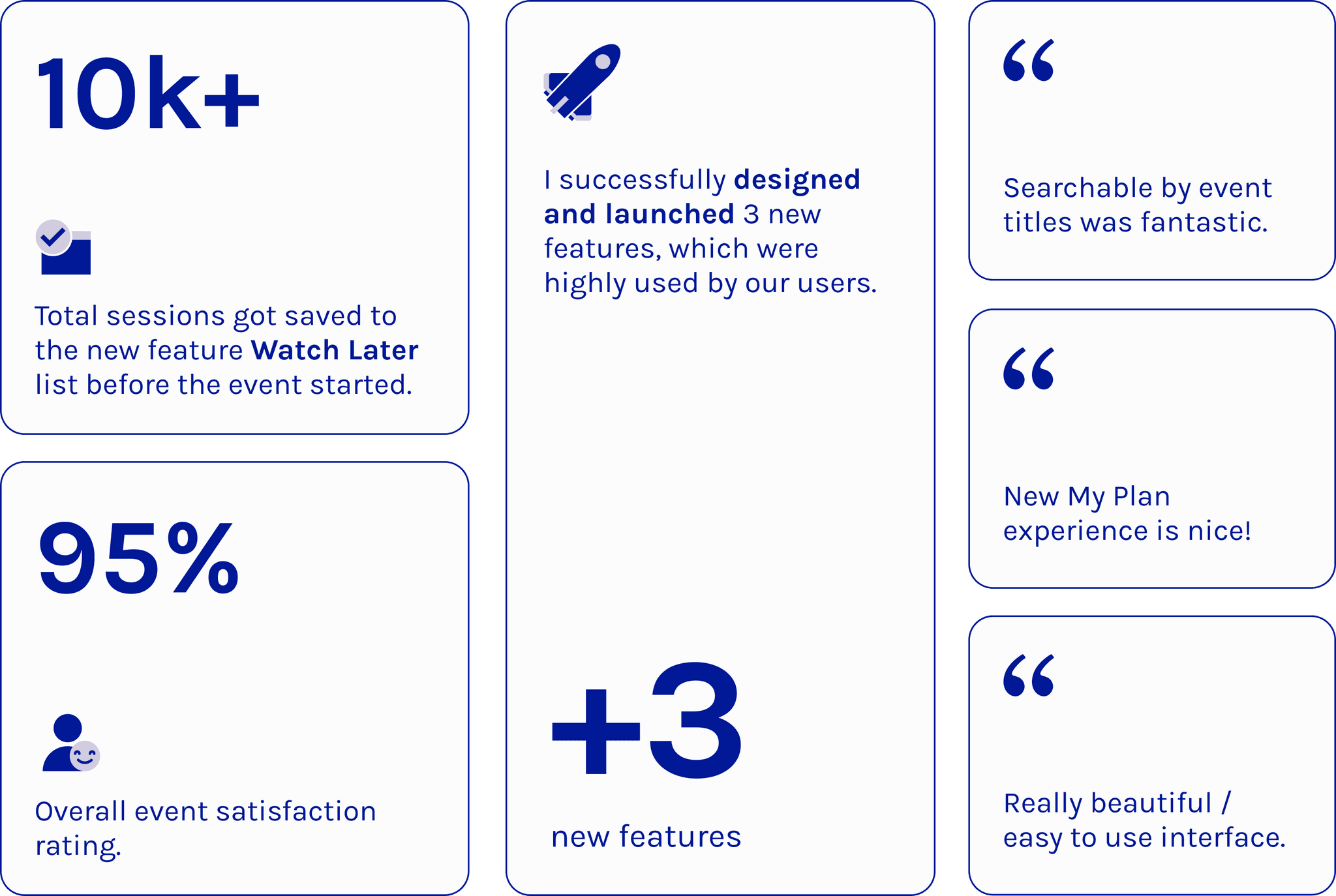
The grand finale!
Successfully launched 3 new features: event title filters, a "Watch Later" button and list, and a full-screen view of "My Plan" page. Data shows these features are highly utilized by attendees and have received positive feedback in evaluation forms.
“Overall great UX – no major confusion reported”
——— Developers and PMs
“I really like Ariel. I’m pretty impressed. Great perspective, she isn’t afraid to suggest new ideas, but also respects input from stakeholders. I’d love to keep working with her on other projects”
——— James (Principal PM Manager/ PO of the project)

Victory for UX
One of the most rewarding moments for me was getting the team to really see the value of UX design. As UX designers, we're always working to prove our worth, and it felt like a big win when my work helped shift that perspective. The team said,
“Design should be involved early, and the initial assets should be done before any communication goes out for the Summit. The design and brand should tell the full story from start to finish, not just be added in at the end.”
It was an awesome validation of what we do, and I’m proud that my work helped change how they see UX!